Logisys CS888UV: Glowing Acrylic!
by Purav Sanghani on November 5, 2004 12:05 AM EST- Posted in
- Cases/Cooling/PSUs
External Design
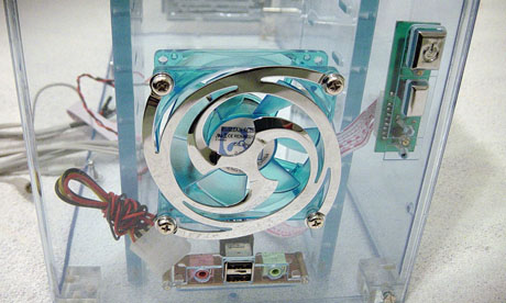
Acrylic cases are similar in design to their metal counterparts. Starting with the front bezel, we notice that the top half of the CS888UV is made up of four 5-1/4" drive bay covers, all clear to match the acrylic construction of the case. The drive bay covers are secured to the case's bezel by a pair of flathead screws on either side. The same goes for the smaller 3-1/2" drive bay covers directly below.The bottom one-third of the CS888UV's bezel consists of a custom-designed fan grill, which looks great, but doesn't seem to be one that could protect the fan from any foreign objects. There is enough space to insert a pen or some other object that could jam the fan.

Note: This design is not ideal for users who have small children.
Click to enlarge.
To the right of the fan grill is the power and reset buttons. The power button is sized adequately with the power logo displayed on it. The reset button sits directly below the power button and is, of course, smaller to reduce the risk of it being pressed at inconvenient times, for example, when playing a video game, or encoding that family video. Below the buttons are the power and HDD activity lights, which, as we will explain later, provide the only luminance during power on.
At the bottom of the front bezel are the audio and USB ports. The audio ports are positioned on either side of the vertically stacked dual USB ports. For some reason, there isn't a FireWire port implemented in the design, which doesn't really turn us off - but, since almost all other cases do, it does take some points away from the functionality of the CS888UV.
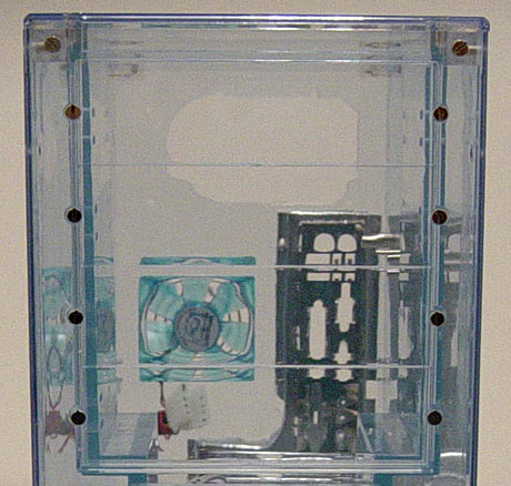
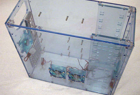
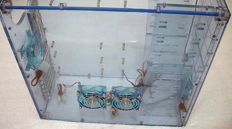
The left side panel is composed of dual fans positioned on the inside of the panel. These fans have the standard circular grills, unlike that on the front bezel, which protect them more effectively. This panel can be removed by removing a total of 10 screws. This is extremely tedious if we need to replace hardware more often than not. Logisys could have effectively reduced the number of screws needed to hold the CS888UV together by planning out the most efficient place to position the points. Hopefully, Logisys will take this into consideration in future designs.


17 Comments
View All Comments
Zepper - Monday, November 29, 2004 - link
Clear cases are only for store and show displays - they have little or no EMI/RFI containment/rejection..bh.
The Beave - Sunday, November 7, 2004 - link
#7, I agree. And who reviews a UV reflective case and doesn't shine a UV light on it to see how it looks? I don't care if the manufacturer didn't include one, it's the main reason anyone would buy this case in the fist place, and the reviewer didn't even try to do it. One of the worst hardware reviews I've EVER read.KristopherKubicki - Friday, November 5, 2004 - link
WooDaddy: Dont forget Lian Li either.Kristopher
SMT - Friday, November 5, 2004 - link
That's gotta be the most impractical case design ever. This case is to computers what the Peavey Dan Armstrong is to guitars.stephenbrooks - Friday, November 5, 2004 - link
Well... This case is clearly for novelty value and is probably not designed with competing with the best technically spec'd metal cases in mind. I think it achieves what it's supposed to do pretty well - kind of a cross between a PC and a lavalamp-like glowy room oddity.Slik - Friday, November 5, 2004 - link
meh, I don't like where the fans are placed on this case; but Acrylic cases in general are great looking if you set them up properly.I also wouldn't expect an acrylic case to crack on you, If you manage to crack it then you're already handling your computer case way too rough.
Its a matter of personal preference, like steel and aluminum there are good looking cases and ugly cases; This being one of those ugly cases. :)
LoneWolf15 - Friday, November 5, 2004 - link
The side fan design is simply horrible. It maximizes cable clutter, for one. Mounting two side fans in the middle? It doesn't take an engineer to understand that it would make a lot more sense to put one fan over the CPU area where it gets hottest, and one fan in a top blowhole as hot air rises to the top of the case. Routing cables for these would also be far cleaner. Logisys also had enough space to make front and rear 120mm fan mounts, and blew it. Just as much airflow with less noise, and less power consumption.michael2k - Friday, November 5, 2004 - link
#5But if Macs were half as good as PCs, Apple would have to lower their prices accordingly :P
WooDaddy - Friday, November 5, 2004 - link
#1 Agreed...It looks like the only company to really come out with Apple like designs is SilverstoneTek. We should make a thread tracking the coolest (not by temperature) cases that break the norm for PC cases... including the demon/transformer/car looking cases. I'm a 28 dude and I don't want my case looking like a fisher-price, mattel reject.
bldckstark - Friday, November 5, 2004 - link
Jeez. Leave the mechanical design to the mechanical guys. I am almost positive that the reason they have 10 screws in the panel is to minimize thermal distortion of the acrylic at operating temps. If they had used 4, you would have complained about the gaps and warpage (and EMI leakage) that occurred every time the case heated up. Also, no one wants to use the red washers I agree, but the washers are there to minimize the probability of cracking and to help with vibration and sound issues. These are all valid reasons NOT to buy an acrylic case, but not reasons to rip on them either. I've seen better $35 cases than this one.