MGE Viper: Another Xtreme Gamer Creation
by Purav Sanghani on December 18, 2004 5:14 PM EST- Posted in
- Cases/Cooling/PSUs
Enternal Design (cont'd)
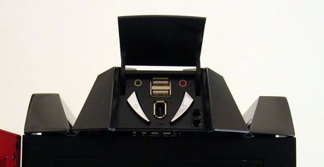
At the top of the Viper, we immediately noticed two rails on either side of the case. They are placed there to be used as handles so one does not strain his or her back lugging the case from one place to another. Well, not so much really. The rails extend from front to back and seem strong enough to withstand a great amount of weight.At the front of the chassis, at the top, there is a pod-shaped module that houses the auxiliary connections as well as the power and reset buttons. A small, push-to-open door hides these from view, which keeps the look as clean as possible. The back portion of that pod is vented, which MGE says will help cool the system. However, when drives are installed in the top-most bays, air flow to that area will be minimized significantly. The auxiliary module does not make much sense to be as big as it is and, in our opinion, takes up too much space on the outside of the case.
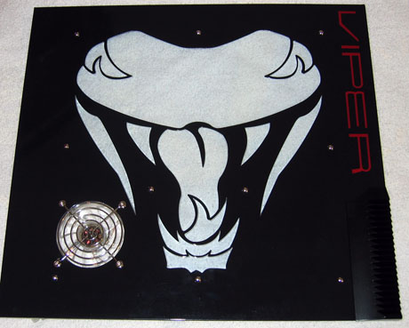
The side panels, especially the left side panel, are very exciting to look at. Though many will have mixed feelings on the art, we believe that the Viper logo window is a great added touch to the theme. Each side panel also features "Viper" printed towards the front of the panel, similar to the Sidewinder case.
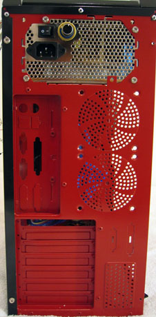
Looking at the backside of the Viper, we see the first signs of a well done paintjob. The entire backplane is painted red to match the color scheme of the Viper. We see mounts for two optional 80mm fans, which we will talk about later, a couple serial/parallel port cutouts, and a removable/replaceable motherboard backplate. MGE also includes a plastic "Static Wire Guard", which is meant to organize and protect the wiring from the system during mobility. We did not think that this was necessary, since wiring can still become tangled and be bent.


41 Comments
View All Comments
Aquila76 - Sunday, December 19, 2004 - link
AnadTech's case review team - Here is what 99% of your readers look for when buying a case:Subtlety
Great Cooling
Subtlety
Internal features
Subtlety
Room for expansion
Subtlety
Did my semi-sublimnal hints get the point across?
for an example of just such a case, which I received and setup last week, look here:
http://www.newegg.com/app/ViewProductDesc.asp?desc...
mrdudesir - Sunday, December 19, 2004 - link
im glad i read these comments and found more people like me who are sick of the overblown "modded" cases flooding the market now. I just want something slick, classy, and unobtrusive (why i love my antec sonata so much). Not to mention from my experience these premod cases are loud as hell and cheaply constructed.Poser - Sunday, December 19, 2004 - link
I was a little surprised to see the comment about the internal speaker being worrysome. See the question, "The enemy within?" here for why:http://www.dansdata.com/io014.htm
TinyTeeth - Sunday, December 19, 2004 - link
Oh yeah, by the way, sorry for the double post but, is Anandtech going to review the Dragon? That case seems quite a lot more interesting.TinyTeeth - Sunday, December 19, 2004 - link
Sure, it looks a bit cool, but it ain't anything I'd like on my desk. This is something you show off at LAN parties, not using every day.Besides, the front looks plastic and a bit like it was built in LEGO.
MemberSince97 - Sunday, December 19, 2004 - link
The upcomoming Dragon looks acceptable...kmmatney - Sunday, December 19, 2004 - link
The blue version of this case looks better than the red, IMO. Microcenter has it advertised with a 500 Watt PSU, but I think it needs to be cheaper than $99 if it going to sell.Panther - Sunday, December 19, 2004 - link
is there a shortage of legitimate hardware to review around the labs?istari101 - Saturday, December 18, 2004 - link
I like the simplistic, clean style of a coolermaster case. Specifically the Praetorian, but those gaudy plastic facings of the reviewed case is definitely not my thing. Neon lighting in cases is distracting for me.Bonesdad - Saturday, December 18, 2004 - link
cmon, lets do some reviews on REAL cases. Gawd, this has to be the one of the fugliest things evar.