Apple's Mighty Mouse: The Move to Multi-Button
by Anand Lal Shimpi on August 4, 2005 8:10 PM EST- Posted in
- Mac
About a year ago, I put all prejudices aside, cast away all of my prior experiences with the platform, and I tried a Mac for a month.
The experiment, as I called it back then, was very much a success. I've integrated the Mac platform into my regular computer usage, using it for a lot of my work, while also continuing to be an avid PC user. Giving Macs a chance for the first time last year wasn't all that hard, except for one major issue on which I would not budge: the mouse.
One of the defining Mac vs. PC arguments has always been the mouse argument; more specifically, Macs had one-button mice, while PCs had two. More recently, PCs grew a few more buttons and wheels on their mice, all the while Apple refused to move beyond the one. There are many justifications thrown about for the use of a one-button mouse, just as there are many for the use of a multi-button mouse, but regardless of what they are, they have been here for a couple of decades now.
Back during the planning days of my Mac experiment, I knew that in order to give the platform a fair chance, I couldn't use that mouse. I'd spent my mousing-life with two buttons and having to give one of them up would be too much to ask, if I were to be as objective as possible. As time went on, I began to see both sides of the argument and truth be told, today, I can actually get by with a one-button mouse on a Mac just fine. I still prefer to have a multi-button mouse, but it's not the deal breaker for me that it once was.
Of course, now that it's no longer a problem for me, Apple finally broke tradition and launched their first multi-button mouse for USB enabled Macs, and it's called the Mighty Mouse and it retails for $49.99.
Apple's one button mice in the past haven't really had a button; rather, the entire surface of the mouse acts as the primary mouse button. Pushing it down makes the mouse click and acts as a left or primary click. The Mighty Mouse works the same way, but there are now touch sensors below the left and right halves of the mouse that sense whether or not you are trying to left or right click. So, although a left and right click mechanically trigger the same button, the sensors below the surface of the mouse determine the sort of a click that you're trying to perform. I'll get to whether or not this actually works well in a moment.
Apple has effectively built the world's first multi-button mouse that's designed to look and work primarily like a one-button mouse. And now it's time to find out if they did a good job in doing so...
The experiment, as I called it back then, was very much a success. I've integrated the Mac platform into my regular computer usage, using it for a lot of my work, while also continuing to be an avid PC user. Giving Macs a chance for the first time last year wasn't all that hard, except for one major issue on which I would not budge: the mouse.
One of the defining Mac vs. PC arguments has always been the mouse argument; more specifically, Macs had one-button mice, while PCs had two. More recently, PCs grew a few more buttons and wheels on their mice, all the while Apple refused to move beyond the one. There are many justifications thrown about for the use of a one-button mouse, just as there are many for the use of a multi-button mouse, but regardless of what they are, they have been here for a couple of decades now.
Back during the planning days of my Mac experiment, I knew that in order to give the platform a fair chance, I couldn't use that mouse. I'd spent my mousing-life with two buttons and having to give one of them up would be too much to ask, if I were to be as objective as possible. As time went on, I began to see both sides of the argument and truth be told, today, I can actually get by with a one-button mouse on a Mac just fine. I still prefer to have a multi-button mouse, but it's not the deal breaker for me that it once was.
Of course, now that it's no longer a problem for me, Apple finally broke tradition and launched their first multi-button mouse for USB enabled Macs, and it's called the Mighty Mouse and it retails for $49.99.
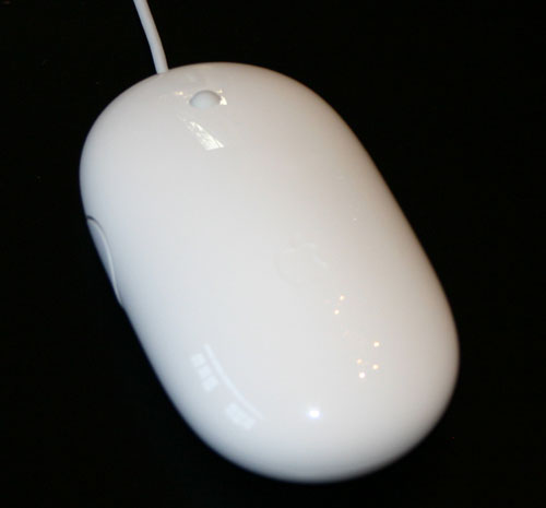
The Mighty Mouse
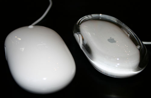
Mighty Mouse (left) vs. Apple Optical Mouse (right)
Apple's one button mice in the past haven't really had a button; rather, the entire surface of the mouse acts as the primary mouse button. Pushing it down makes the mouse click and acts as a left or primary click. The Mighty Mouse works the same way, but there are now touch sensors below the left and right halves of the mouse that sense whether or not you are trying to left or right click. So, although a left and right click mechanically trigger the same button, the sensors below the surface of the mouse determine the sort of a click that you're trying to perform. I'll get to whether or not this actually works well in a moment.
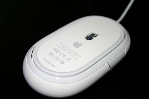
The underbelly of the Mighty Mouse
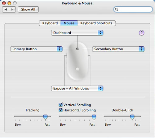
Apple has effectively built the world's first multi-button mouse that's designed to look and work primarily like a one-button mouse. And now it's time to find out if they did a good job in doing so...


45 Comments
View All Comments
kelmon - Friday, August 5, 2005 - link
Great article. I'm pretty interested in one of these mice as my current MS IntelliMouse is getting a little long-in-the-tooth and could best be used with my old PC these days. Since I'm going to be in London in a couple of weeks I'll stop in at the Apple Store there and see if I can play with one for a bit. Gaming isn't something that I do very much these days so that aspect shouldn't be a problem, so if it feels comfortable and the scrollball works well for me then I'll probably buy one (assuming that I can persuade the wife...).Anyway, a great summary of the features and it definitely highlights the need to "try before you buy".
jkostans - Friday, August 5, 2005 - link
What I got from this article: The mouse sucks, but we don't want to offend the mac people so we'll be very very nice about saying it. I have no idea why anyone would buy this after seeing this or any other review on the web.jazzcrazed - Friday, August 5, 2005 - link
Well, it's important to know that the prospective users of this mouse are not reserved to users of multi-button mouses, but also users of the one-button Apple Pro Mouse - which are, believe it or not, the majority of Mac users. Us PC users who've all our lives used multi-button mouses most certainly do not know the perspective of someone who's exclusively used one-button mouses. Anand emphasized his subjectivity on this matter, and rightly conceded that in many cases he could not speak universally on certain features. He wasn't writing this review just for PC users, but Apple Pro Mouse+Mac users.For what it's worth, I think it's definitely a more scrutinizing review than <a href="http://arstechnica.com/reviews/hardware/mightymous...">http://arstechnica.com/reviews/hardware/mightymous... Cheng's at Ars Technica</a>.
Griswold - Friday, August 5, 2005 - link
Why is Apple going to extreme lengths to be different and sacrifices usability for that? Are they afraid of being compared to (superior) products and thus hide behind fancy gimmicks nobody really needs or wants?fishbits - Friday, August 5, 2005 - link
I was asking the same thing myself. The basic three-button mouse with scroll wheel works fabulously, and if you can't improve on that or even come close, don't bother. But that's the weird cultish power of Apple. Because it's different it must be better, and because it's Apple it must be better. Even when it isn't.Even Anand falls for it to some degree. Cracked up reading his lapse into battered wife syndrome:
"It's my own fault, I brought it on myself!" A PC user buys a crappy mouse and says "This thing is a piece of junk," throws it out and buys one that works right. An Apple user buys a crappy Mighty Mouse and says "There must be something wrong with ME!" Too funny.
Backslider - Friday, August 5, 2005 - link
My thougths exactly, WHY! Just make it two buttons and be normal. I wonder how much money they spent in engineering this stupid gimicky crap. If I was an investor I would be pulling all my stock out today.Davediego - Friday, August 5, 2005 - link
You mentioned you wished other mice had horizontal scrolling... well your mx1000 does. The scroll wheel titls to the side.Dennis Travis - Friday, August 5, 2005 - link
If you read farther down Anand states his MX1000 has horizontal scrolling.radonX3 - Friday, August 5, 2005 - link
I don't understand the logic of Apple. Everything they make are flashy toys with no real functionality behind it. This mighty mouse is another example of it.Hywel - Monday, August 8, 2005 - link
I think you're wrong here. "Everything they make are flashy toys with no real functionality behind it", is just plain wrong. It's a common accusation that Apple are all form over function, but it just ain't true. The majority of Apple product offer form and function.However, in this particular case, the stupidly named Mighty Mouse, Apple have produced a lemon. For all the reasons the review mentions. For the 'battered wife' syndrome mentioned in a comment below, and probably a whole lot more.
I've been thinking about getting a multi-button mouse for a while, but it's not been a priority. Unlike a lot of Mac people, I think properly designed context sensitive menus are fabulous - as long at they're contextual, and not just a bunch of unrelated crap. So I was ready to jump on this thing. Given two products that are essentially equal, I'd go for the Apple one, even if it was a few quid more. Simply because they usually make good stuff that's easy to use. I'm not buying this thing though. I've thought about it, and I think this review is being a bit soft on Apple. This mouse is over-engineered. It solves a problem of Apple's own invention: "Make a two button mouse with no apparent buttons", when the real job spec should have been "Make a bloody good comfortable multi-button mouse that's better than anything from Logitech or Microsoft".
The mighty mouse is crap.