iPod vs. Zune: January 2008 High End MP3 Player Roundup
by Ryan Smith on January 21, 2008 12:00 AM EST- Posted in
- Smartphones
- Mobile
iPod Touch
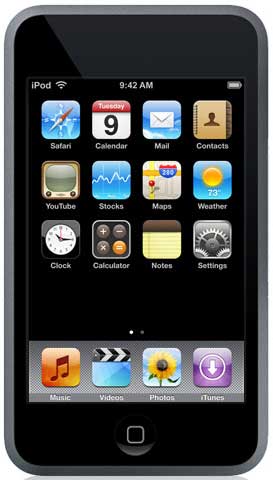
Earlier we called the iPod Classic the old guard, and for good reason. The iPod line started as just an audio player and that's what the Classic does best. However it's also at an evolutionary dead end, it isn't practical to expand it to both be a more functional device and also the iPod Classic at the same time. The next step requires a clean break from the old guard and so we have the new guard, the iPod Touch.

Fundamentally the iPod Touch is a stripped down iPhone. It has the same ARM processor, the same 512MB of RAM, the same version of OS X, the same 3.5" touch screen and many of the same applications. The Touch is for all practical purposes a very small PDA/computer optimized for media use. If you've read our iPhone review then you already know what to expect, otherwise keep reading.
Whereas the iPod Classic was the natural evolution of the iPod line, the Touch is practically unrecognizable as an iPod. The large touch screen eliminates the need for all buttons except a single home button, marking the end of the iconic iPod scroll wheel. You almost can't compare the two, they're simply such different devices that it's an iPod in name only.
Besides the large touch screen, as the new guard the Touch hardware also has a few other key differences compared to the old guard. In spite of being a high-end player in the price range of hard drive based players, it's flash memory based Coming in at $299 for 8GB and $399 for 16GB, it's $50 more expensive for 1/10th the capacity of the two respective iPod Classic models. This makes the Touch a gamble for Apple, compared to other players it's ridiculously expensive for the capacity it has.
Given the space needed to support the large screen, the more powerful electronics, and a larger battery to drive all of this we can see why Apple went with a flash based player, but there will be a lot of customers who will not want the Touch due to this issue. We're left curious just how big an Touch with a hard drive would be; based on how the iPhone has been received, we could see something up to the size of the iPhone still being practical, especially since the Touch is starting out at only .31" thick.
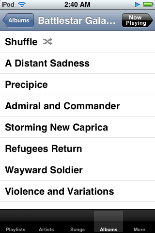
With that said since it's an iPod and supposed to be primarily a media player, we'll jump to the more pressing question of its media player abilities, before getting in to the utilities and the subtleties of the hardware design. For playing audio, the classic iPod hierarchical navigation system is still in use, but with modifications for the touch screen. It's good to see that Apple decided to not rock the boat too much here, as the hierarchical navigation system is still every bit as good on a touch screen as it is the scroll wheel.

Unfortunately we can't say much else that's nice about the music UI, and it's not for a lack of trying on Apple's part. The touch screen just isn't a great replacement for the scroll wheel; Apple was tasked with replacing the perfect media player control and couldn't do it. A touch screen means we no longer have blind navigation and the touch screen can't offer the kind of precise controls the scroll wheel can, meanwhile the bigger screen isn't doing anything more for us.
Volume and song position are particularly bothersome, as the screen is only a good three-thumbs wide, making it easy to adjust something incorrectly or requiring more time and concentration to adjust something to precisely where you want it. It works, probably as well as Apple can ever hope to achieve, but it's definitely not as good as the scroll wheel.

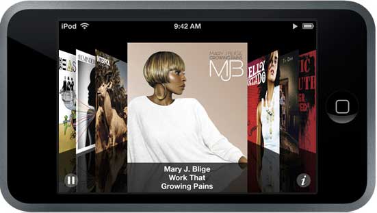
We also are not very impressed with cover flow, the alternative UI that allows browsing songs by cover when the music application is open and the Touch turned on its side. It looks pretty and it's easy to use, but we're not sold on it actually being useful. On the one hand it's extremely reliant on having cover art for all of your songs, and on the other hand it's extremely reliant on you knowing the cover art for every album is to make efficient use of it. Text may not be as fancy as artwork, but in the digital age cover art just isn't as meaningful when we don't have a real copy of the art anyhow. We'd really like to have an option for a widescreen UI when the Touch is turned on its side, it would help us deal with the volume and song position issues we mentioned previously, due to the fact that we could have longer volume/position bars.
Other than these issues, the Touch is a competent audio player. The format support is the same as the Classic and the audio quality is the same (we'll have more on that later in our benchmarking section) so on a technical level it's just as good of an audio player as the Classic is. If it wasn't for the fact that the Touch used a touch screen and had to forgo the scroll wheel, it would be just as good as the Classic. The touch screen is the Achilles Heal of the device that drags it down as an audio player.
Yet on the other hand the Touch's video abilities put the Classic to shame; unlike the Classic it's clearly designed for video use. It still suffers from the general control issues brought about by the touch screen, but unlike the Classic the nearly device-sized screen makes watching videos practical and something that you'll actually want to do with the device. With a resolution of 480x320 (twice that of the Classic) and a 3.5" screen, the Touch is extremely comfortable to watch videos on. It's not quite perfect because of the control issues, but it's very close.

Incorrect formatting

Correct formatting
We did find an issue with letterboxed videos however; with one of our test videos encoded at 640x480 the touch proceeded to completely cut off the letterboxing, distorting the image. We don't have any other videos that this occurs on so we can't gauge how prevalent the issue is, but never the less it's there and bears mentioning.


50 Comments
View All Comments
ThePooBurner - Tuesday, January 22, 2008 - link
Since the article is on current gen, we should only compare current gen. So you can't say apple is superior because of it's touch wheel when creative has the same. My Zen, the Vision:M is a few years old and can be had for under 200$. For that you get video playback of more formats (and an included transcoder for formats that aren't natively supported) than the Ipod, an FM tuner, a Microphone for dictigraphing, an 8gig jump drive that is seperate from the 30gig main drive, and jump dive like operation for the 30gig main drive, so you can use it on any computer. As far as i know, the Ipod has non of this without buying extra parts. I like the GUI of the Zen better than the Ipod by a lot, though the zune's GUI is actually pretty nice in places. Plus, Creative practically invented sound. I would wager that the sound quality and output, etc. are superior on the Zen compared to the other players as well. My music sounds good n matter what i have hooked to it to produce the sound, be it headphones, speakers, or even a TV. Even sounds great when using my 20$ FM transmitter for playback in my car. Plus my battery lasts for ever. I've gotten fairly close to 24 hours of operation. Granted time depend on a few things, as I've gotten as little as 14 also, but i know that the capability is there to meet the advertised claims, or better. And the 60gig version has even more features than mine does!Actually, other review sites, when my version of the Zen came out, said everything i have said and added "Creative has once again created a superior product to everyone else, but will the market give it the credit it deserves, or will it be like Beta? only time will tell."(that's a paraphrase from memory, so forgive if it isn't 100% exact). In short, the Zen is Better and cheaper than the competition. In every way.
michael2k - Wednesday, January 23, 2008 - link
So you want to compare to today, or a few years old?Because from the Creative web site, only the flash players are in stock. The Vison M, Vision W, and even the Zen are out of stock.
But a theoretical comparison of the Zen M vs the iPod classic shows us that the iPod is smaller and more pocketable, has more storage, and longer battery life. A comparison of the Zen W with the iPod Classic shows that the Classic is still smaller and with a better control scheme, more storage, and better battery life.
Of course what you say about the Vision:M may have been true in 2005 when it was announced... except that even then the iPod was thinner, had greater storage, and similar or better battery life.
So sure the "lead" may jump back and forth every time a refresh is announced, but Apple has "consistently" lead; first with USB mass storage, first with smaller form factor, first with faster connectivity, and first with easier usability. Eventually (2004 really), Creative caught up with their Zen but by then Apple had a huge lead.
So your point, while valid, is also outdated. Look today; if your Vision:M broke, what would you buy? The iPod would be a very strong contender.
yyrkoon - Monday, January 21, 2008 - link
Well I did not read the whole article, and only read part of the closing thoughts, but from what I have read, you guys have your priorities wrong compared to what most of the people I have talked to, and have seen on the web are saying. At least concerning the audio player aspect.A lot of people are wanting a device that is simple as possible concerning putting music on it, and a device that also has good quality sound(read: clean, with no background hissing or hum etc, etc). Anyhow, most of what I have read indicated that people would rather pay less for a Creative Stone, or something similar that was small, played music decently, has decent ear buds, and dead simple drag n drop file transferring. A good portion of these people also seem to want a device that does not cause music to stutter/pause on a device while navigating through menus, or folders while looking for a song, or settings.
The problem with the two reviewed items in this article is that I have read that the software that comes with each device is garbage. And they are not alone, as many MANY devices suffer from the same affliction from what I have read.
Anyhow, Creative has DEFINITELY been in this part of the industry much, much longer than Apple, or Microsoft, and so has Sony(Although I must admit I have not had a Sony Walkman in many, many years, but I still have one of the first Creative MP3 players ever with 32MB of memory on it).
I think now days, and personally, I would rather have something that is small, but not tiny, sounds decent, has a USB chargeable battery onboard(I dont have a problem taking such a device apart and replacing the battery myself; if and when it is needed), and somethin g that has drag and drop file transferring with the ability to play any music format whether DRM or not. IF this device were an all around media device, then it MUST have the ability to read PDF files. More than 2-4GB on such a device would be a waste for me however, so we are talking onboard flash, and probably a 8-10 hour battery play time before recharges.
TP715 - Monday, January 21, 2008 - link
You might want to take a look at the Cowon D2 and A3. Both have drag and drop and support many audio codecs. D2 is small, available in 2, 4, and 8GB (can increase via the SDHC slot), has USB chargeable battery with 52 hr life and will display TXT files (but not PDF as yet). A3 is probably bigger than you want, but will display DOC and PDF files (with transcoding).Others: AnandTech did mention that this is only the first of reviews on MP3 players, so others will probably be covered. I would suggest they look at Cowon as well as Creative Zen etc. They are available only online, are a bit expensive, and have nonstandard UIs, but they have good audio quality and lots of codec support (incl OGG, FLAC, APE etc.). The also support recording, ie line in.
michael2k - Monday, January 21, 2008 - link
I think 119m iPods sold disagree with you.1) Sound quality (if you read the whole article you will see) on the Classic (and correspondingly Nano and Shuffle) iPods are fine.
2) Drag and drop works fine for a couple hundred megabytes (IE, a handful of folders or files) up to a couple gigabytes of files, but falls way short when there are several to tens to hundreds of gigabytes of files. iTunes is then simple (plug and go)
3) The problems described with stuttering/pausing is new, and will probably be fixed. The first 5 generations of iPods did not have this problem.
Anyway, you're welcome to your device. It sounds like you're describing an iPod Touch, so long as you can stand iTunes.
michael2k - Monday, January 21, 2008 - link
I think you need to recognized that for some people the included earbuds fit perfectly.Freeseus - Monday, January 21, 2008 - link
There's something that I haven't seen mentioned in many of these iPOD reviews that I find very annoying. I'm sure I'm not the only one here. Or perhaps, I simply missed over it as I perused this article (as well as previous ones on other sites).The iPOD UI has significant slowdown/pauses/sluggish "stutter" playback while accessing music, particularly when:
a: attached to a transmitting device (iTRIP, for example)
b: while accessing a long or high-quality song
Many a time I find myself waiting to see the data appear and waiting to see the song begin to play. I don't even need to mention the album art in the new Classic, which suffers the same problem as iTUNES does in general with displaying custom artwork as you scroll through your music.
And in the latest CLASSIC generation of iPODs, the "stutter" is at least twice as bad as it was in the previous generation.
Why has this not been mentioned? I considered getting a ZUNE simply because I was tired of the lacking capabilities of the iPOD's processing/coding. But, I haven't purchased a ZUNE simply because there is no 160gig model.
The newest iPOD classic is a step down from the previous generation. It needs a cleaner, less intense UI and/or some more powerful hardware. End of story.
Ryan Smith - Monday, January 21, 2008 - link
It wasn't mentioned because I never experienced it on the 6G hardware. I also own a 5G where I have experienced it, so I see where you're going, but I have never had that issue with the Classic used in this review.cmdrdredd - Monday, January 21, 2008 - link
I find that anandtech has fallen into Apple's traps like so many others. The iPod is hardly the be al end all of players anymore. Hell, the Zune has a FM tuner which Apple expects you to pay for in an accessory. The Zune also bundles earbuds that actually sound good, no Apple's pack in ear buds are nowhere the quality. Plus, I don't have to do the "safely remove hardware" to disconnect my zune, I can just unplug it. Doing that with your iPod can corrupt it completely. The battery life on the Zune I find better than mentioned here. Turn off the WiFi if you don't use it. On the touch if you use the web features it's necessary, but mostly for the Zune you don't need it. It's not ment to do the functions the iPod Touch does via wifi so having it on is unfair in the comparison. The zune has flaws too like the screen not being very high rez for it's size, and inability to put videos into a playlist. The latter of which is easily fixed via software update.The Zune also has the bonus of not using a case that is easily scratched.I also find the UI to be more eye pleasing than the iPod classic because of the ability to customize the background.
I'm honestly just a little sick of people writing off everything else as an option and telling everyone else to just buy an ipod because it's "cool" or "it's an ipod, duh". That's the same as telling everyone to buy a Wii, even when the Wii doesn't have the games people buy an Xbox360 for.
lefenzy - Wednesday, March 5, 2008 - link
I agree with you about the ipod not being the best, but I've never had an issue pulling out my ipod nano without safe renewal.