Gigabyte GM-M8000 Mouse - A GHOST Story
by Gary Key on June 15, 2009 3:00 PM EST- Posted in
- Smartphones
- Mobile
Gigabyte ships version 1.00 of their GM-M8000 AP software suite in the current retail package. Based upon our early testing with it in Vista 64, we just recommend using the CD as wall art and download version 1.02 before you use the mouse. Gigabyte also ships a nifty 4D Wheel Driver utility that allows you to setup the scroll wheel via a new tab in the standard Windows mouse control application. Gigabyte's software installation is simple and easy while requiring about 11.5MBs of disk space. The software supports Windows XP, XP-64 Edition, Vista, and Windows 7. The mouse worked in Mac OS X and various Linux builds but the software that enables special features and button assignments is not compatible with either operating system, thus negating the major benefits of the GM-8000.
The primary purpose of the GM-8000 AP software suite is to allow complete control over the mouse's hardware capability. The interface is simple and intuitive. The program offers a vast array of options to control the various buttons and center wheel on the mouse. We could spend pages on showing each of the 30 individual settings available to each button and a vast array of Macro settings. Instead, we will simply display the configuration windows and recap any major items of interest we discovered during testing. One item we suggest the user have available is a decent pair of sunglasses when using the software as the bright yellow background could cause blindness in small children and pets. However, you do get used to it over time but we wish that Gigabyte would utilize their corporate blue color scheme in future software releases.
Once we loaded the software and rebooted, the first order of business was to understand how memory hungry the two applications are in Windows Vista 64 Ultimate. The results were surprising considering our experiences with the Logitech programs. GM_M8000.exe and Wh-exec.exe consumed a total of 6.5MB of memory while active compared to the 18MB footprint of the Logitech SetPoint software. CPU usage was nominal during all phases of testing.
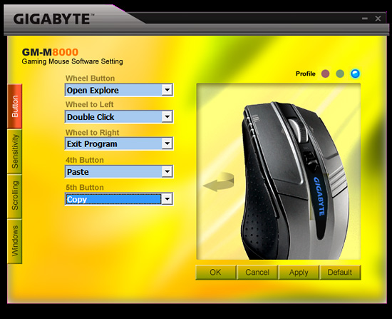
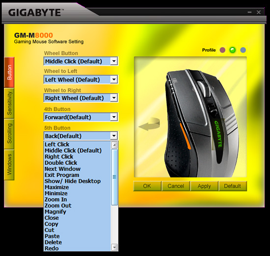
The primary screen allows the user to define the function of the scroll and thumb buttons. A listing of the additional button command options is shown in the pull down screen. Each of the left side buttons or the scroll wheel has its own display screen and option choices.
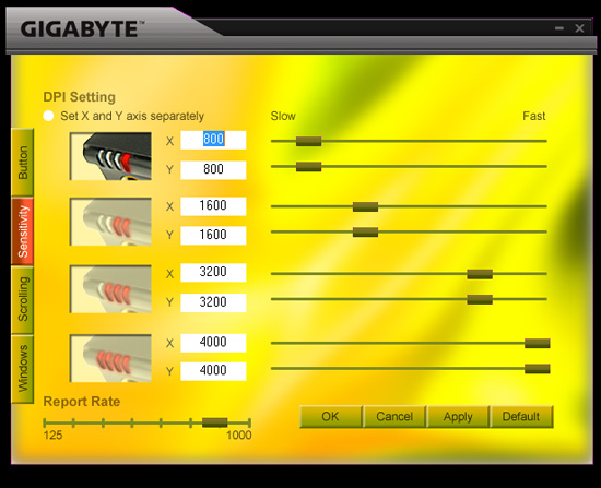
The Sensitivity section will change your perspective on life in general and allow you to become a better person. Actually, it provides quick adjustments to the dpi settings on an individual basis for the X and Y-axis if required. The dpi button on the mouse will utilize the user requested changes in this tab. The user can also adjust the USB report rate from this screen.
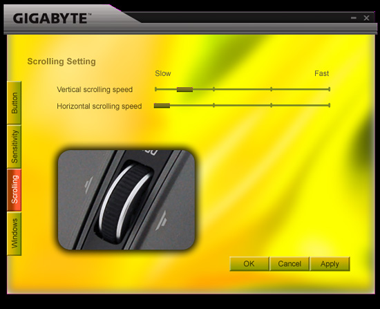
The Scrolling section allows for individual settings for both the vertical and horizontal scrolling speeds. The settings are very basic and we noticed once you got past the first tab marker on the slow side that the scroll speeds tended to get out of control.
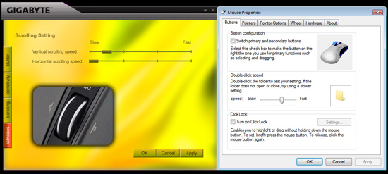
The Windows tab will bring up Window’s mouse properties box that now includes a new tab to adjust the scroll speeds with finite control and to test those changes before accepting them. This section also includes the ability to set the mouse in MS-Intelli Mouse compatible mode in case your application is having problems with the GHOST software mode. The left and right scroll button commands did not always work in several applications without having the driver set installed. Even when installed, the left/right feature did not work in freeware applications like Sweet Home 3D (wonderful home planning tool) or several flash based games. However, this feature did work in the major application packages we tested.
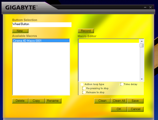
One of the most unique features on this mouse is Macro capabilities for the adjustable buttons. The two side buttons (4th/5th) have 509 bytes of memory assigned to them that equates to about 200 script commands. The scroll wheel button has 253 bytes of assigned memory that equates to around 96 script commands. The user can design up to 15 custom Macros over the three profiles. We were able to setup a variety of Macros ranging from simple open and close commands to actually running several of our mouse friendly benchmarks in programs like CyberLine Power Director 7 or Maxon Cinema 4D R11.
Multimedia programs like Windows Media Center or iTunes did not work properly with the Macro commands. Gigabyte actually warns the user that several media applications might not work right in their written documentation, so no points off those problems. The most useful function was the interval time function that could be set to wait a predetermined time between two commands that allowed several of our mouse friendly benchmarks to complete with a single click of a button. Alright, a true scripting language is better suited for that purpose but it does show the power of the Macro capability on this mouse.


44 Comments
View All Comments
Samus - Tuesday, June 16, 2009 - link
I love my corded OCZ Equalizer. It also cost less than 20 bucks and has been blinking along that lonely mousepad trail for years.cosmotic - Monday, June 15, 2009 - link
Are you serious? It's hideous! Why are they custom painting their driver window? You should not be reinforcing this sort of crap behavior.teohhanhui - Tuesday, June 16, 2009 - link
Logitech does that too...mindless1 - Monday, June 15, 2009 - link
Does that REALLY matter?aeternitas - Monday, June 15, 2009 - link
Some people like their UIs to be standardized. I for one agree. Im getting sick of utilities that think they are unique by giving me a hideous UI.It doesnt effect crucial things, but it DOES matter.
ahmshaegar - Tuesday, June 16, 2009 - link
Even Microsoft doesn't standardize their UI; why should Gigabyte?niva - Tuesday, June 16, 2009 - link
Umm... actually they do, everything in the windows OS has a generic look and feel ranging from explorer to the admin tools. I totally agree with this comment, Asus does the same crap too (example: the asus update utility.) I'm all for allowing apps to be skinned but they should come with a default skin that utilizes the OSs selected look and feel. If you're going to skin something by default at least do a good job at it.MamiyaOtaru - Tuesday, June 16, 2009 - link
They do? Media Player and Office spring to mind immediately as apps that don't match the others.aeternitas - Wednesday, June 17, 2009 - link
WMP and Office are consistent with what they are doing and with the general Vista pioneered UI. When you up a window to open up a file, you dont see a bullshit Win 3.1 menu system pop up. You see a standardized and easily manageable windows from the MS framework.Stop arguing, you're wrong.
ahmshaegar - Tuesday, April 27, 2010 - link
A year later! I'm baaack!And that last comment was highly unnecessary. Boo hoo. But anyway...
Let's dig into your comment. You said something about consistent for what they are doing. Well, okay, but I was under the impression we were talking about consistency with Windows (meaning consistency with Explorer, the Windows file manager.) So I'm not sure what consistency for what they are doing means. You also mention they're consistent with Vista. I'm not aware of Vista making use of Ribbons extensively. And then you bring up Windows 3.1-style dialog boxes. What does that have to do with anything?
"You see a standardized and easily manageable windows from the MS framework." Okay. But if you grew up with Windows 3.1, that would be easily manageable. And Windows 3.1 was standardized, too, to some extent. And since it's a Microsoft product, wouldn't it also be some kind of "MS framework"?
Moving on....
We have Windows Explorer (by that, I mean the file manager.) We have Office. We have WMP. We have many random applications. In general, if you run some random old application, it's going to look like Windows Explorer.
Of course Office is generally internally consistent, and so is WMP. But the point is that Office is not consistent with Windows. Now, I haven't used the latest versions of Office, (can't afford it, so I'm stuck with OpenOffice) but I am aware it uses that Ribbons interface or whatever they call it. I think some other apps use ribbons... Paint? But the point is it's not consistent with Explorer.
So Office is its own program, if you will, and so is this mouse driver. The mouse driver is not consistent with Explorer, and neither is Office. In that sense, they're not consistent.
On the other hand, if you want to change the boundaries of the argument and say that Office is internally consistent with itself, then I guess we'll just have to say this mouse driver is internally consistent with itself.
But let's forget about consistency for a moment. I couldn't care less if all my apps are consistent, because certain specialized apps may require a different UI paradigm for maximum efficiency. If the UI allows me to work better, then I'm all for it. Of course, the tradeoff is a learning curve, but life is full of those. Unfortunately, I can't argue that this UI is better.
Basically, think Media Center. Explorer and other desktop applications are designed for use at a desk, or at least on a computer monitor. The user's eyes are generally no more than half a meter away. Media Center is for use on a TV, so of course the interface is different (and not consistent with the rest of Windows.)
But the argument was merely about consistency, and on that point, we have Office and WMP differing from Explorer (the file manager) for reasons that are debatable, and Media Center differing from Explorer for good reason.
Anyway, I'm aware nobody is ever going to read this comment, but it had to be posted.