External Design
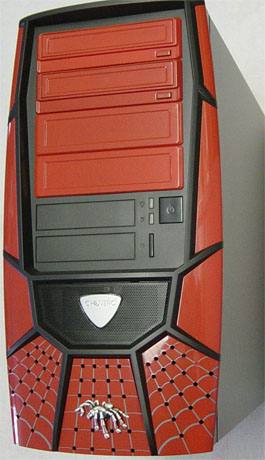
We've seen many manufacturers that will try to put more time and effort into designing a good looking case while paying less attention to the internal features and functionality. We have seen this happen and we have usually seen these products do worse than those that are decent looking with great features.The front of the case is made up of a custom molded bezel, which gives it a look that says gaming all over it. The Xpider II does have a spider theme, but it has been implemented in a clean and meaningful way. The bezel is also unique, since most of the cases that we look at are usually based on another design.
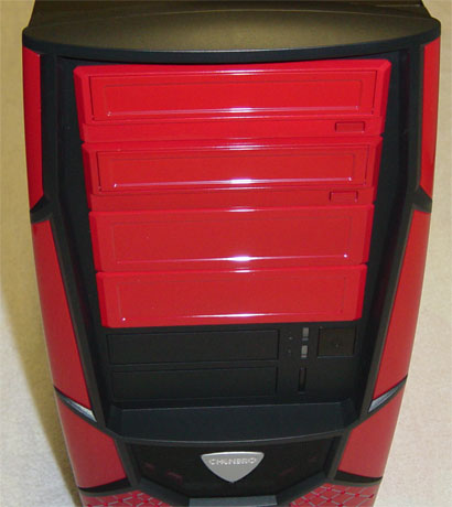
The drive bay covers are painted in one of the 4 available colors to match the rest of the case. The top two 5-1/4" drive bay covers are optical drive bezels, which take away that awful mismatch of color when using a beige colored drive. The bottom two 5-1/4" drive bay covers are the bare type that can be easily removed.
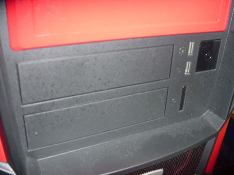
At mid-height are the 3-1/2" drive bays with simple black bay covers to make them blend into that area. To the right of the bays are the power and HDD LED's, and the large square power button to the right of those. Directly below those is the reset button, which is a narrow vertical shape that is difficult to press if you are one with large fingers. It does, however, conform to the shape of the power and HDD LEDs directly above it.
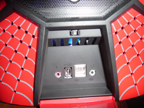
At the bottom of the Xpider II is a flip-down door, which hides the audio, USB, and FireWire ports. The door itself is painted with a web design to match the bottom 1/4 of the case bezel. It also has holes that allow the front mounted fan to pull air into the case.
Above that area is a black mesh metal grill, which is the main intake for this front mounted fan. It has an interchangeable shield shaped aluminum piece that shows off the Chenbro name. The replacement shield is made of a clear plastic and can be swapped out by removing the air filter on the backside of the case's bezel.
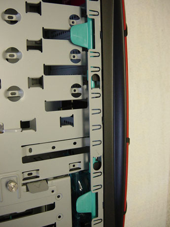
The bezel can only be removed by pulling the release clips on the inside of the case next to the drive bays.
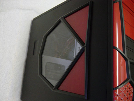
The only other removable panel on the Xpider II is the left side panel for access to the case's internal components. Instead of thumbscrews being used to secure the panel to the Xpider II, Chenbro has implemented a mechanism that locks the panel in place easily.
The panel itself has a diamond-shaped window and is accented by red paint to continue the cases overall look.




33 Comments
View All Comments
Bladen - Thursday, August 19, 2004 - link
If you want a gaming case, look out for the Gaming Bomb II.I have a Gaming Bomb I and it is great.
However the Gaming Bomb II is a bit on the expensive side (first time Chenbro made Al case so the machines had to be retooled).
I think the Xpider II isn't that hot, but I have heard it doesn't look that bad in real view, but Iiiiii'd rather get a GB2.
Head over too http://www.chenbro.com.tw/PR/GBII.jsp and have a looksee.
hdavis01 - Thursday, August 12, 2004 - link
Call me old school but I would take a simple looking, basic, black/white case with sturdy construction over anything with thrills and frills surface features. I won’t flame you guys for reviewing these “flashy” type boxes but please review some of the quality cases with less outside eye candy and focus on ones with more internal detail and functionalities.More cases like the Ahanix X195 Knight reviewed back on 3/04 would be nice.
I believe that your more informed hardcore readers are much more interested in cases that are functional, quality driven structures that hold all our precious, expensive peripheral component pieces tightly and securely in place and cooled to the best possible levels.
Thanks!!
yelo333 - Thursday, August 12, 2004 - link
Umm...that $80 price tag is because of the actually usable power supply...Assuming you liked that look(I definitely DON'T), it doesn't look like it's THAT bad a deal, as you mentioned on the end of the last page.CrimsonDeath - Thursday, August 12, 2004 - link
If i was 10 and was crazy about spidey, then this &$^$%^ might have been my case. Other than that the desing is really mediocre and FUGLY if i may say so myself :) . C'mon show us some serious cases ppl.AnnoyedGrunt - Thursday, August 12, 2004 - link
I think you guys should add some additional criteria to your review. Things that come to mind are:1. How well do the USB and firewire port cables interface with the MoBo.
2. Does the firewire cable have a header for MoBo mounting or does it need to pass thru to the rear firewire port of the MoBo
3. Give extra points for rubber HDD isolators (to me this is a very nice feature that seems so simple yet is missing from many cases)
4. This case only has one removeable cover, which severly limits access to cable routing, I think that should be considered a negative.
5. Agree with the PSU points. At the minimum add a test with the standard PSU so the sound and capability of the stock case is known.
6. This last one may be more controversial, but to me the whole "tooless" trend is usually poorly implemented and makes things wose than cases with simple screws. In particular, drive rails that first attach to the drive and then snap in to the case seem pointless, and the PCI card snaps often don't work nearly as well as a screw. Personally, I would like to see more cases go with thumbscrews and I think you should make more mention of it in your review. It seems like the mechanical build up of a computer is quite small compared to the software installation and setup, and therefore I would like to see less emphasis placed on the build time and more emphasis placed on the ease of access and sturdiness once components are installed.
7. The looks of that case are....well, lets just say that if I had a 5 year old I think the kid would like it. Most others I think would find the looks "controversial" and I don't think anyone believes it has "gaming written all over it". Just IMO of course.
Anyway, nice review overall, but could use more details and I think stronger reaction towards some of the negatives of the case.
-D'oh!
AtaStrumf - Wednesday, August 11, 2004 - link
I build a bunch of PCs with chembro's gaming bomb, which uses the exact same design, but has a much more digestible front bezel:http://www.dinoxpc.com/Tests/ALTRE/ChembroGB/image...
It actually looks better in person, especially without the window in the side panel, so if you can't stand the spider-man bezel, you can allways go with the "gaming bomb".
Unlike some other cases we usually use, I really liked this one, my only gripe would be with the add-in cards holding mechanism, with feels a bit too flimsy.
ciwell - Wednesday, August 11, 2004 - link
That has to be one of the most visually offensive pieces of scrap metal I have had the displeasure of laying my eyes on.nessus - Wednesday, August 11, 2004 - link
Well, pretty much everything has been said. I just wish Anandtech would be honest with their opinions and not try to make the review as long as possible with rubbish. Do you guys ever look at the other review sites?? For instance take a peek at Dansdata. He doesn't have a very pretty site but I think it works and he's very honest about products he reviews...but that is only my oppinion.brian_riendeau - Wednesday, August 11, 2004 - link
"They have released a few gaming chassis in the past few years, which we have not had the pleasure to look at until now.""The front of the case is made up of a custom molded bezel, which gives it a look that says gaming all over it."
I think these two lines pretty much sum up the entire problem... AT is becoming totally disconnected from the users who come to this site.
Nazgoth - Wednesday, August 11, 2004 - link
Is it me or are new cases getting uglier and ulgier :/