MGE Viper: Another Xtreme Gamer Creation
by Purav Sanghani on December 18, 2004 5:14 PM EST- Posted in
- Cases/Cooling/PSUs
Enternal Design (cont'd)
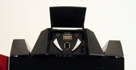
At the top of the Viper, we immediately noticed two rails on either side of the case. They are placed there to be used as handles so one does not strain his or her back lugging the case from one place to another. Well, not so much really. The rails extend from front to back and seem strong enough to withstand a great amount of weight.At the front of the chassis, at the top, there is a pod-shaped module that houses the auxiliary connections as well as the power and reset buttons. A small, push-to-open door hides these from view, which keeps the look as clean as possible. The back portion of that pod is vented, which MGE says will help cool the system. However, when drives are installed in the top-most bays, air flow to that area will be minimized significantly. The auxiliary module does not make much sense to be as big as it is and, in our opinion, takes up too much space on the outside of the case.
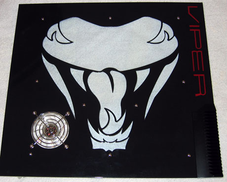
The side panels, especially the left side panel, are very exciting to look at. Though many will have mixed feelings on the art, we believe that the Viper logo window is a great added touch to the theme. Each side panel also features "Viper" printed towards the front of the panel, similar to the Sidewinder case.
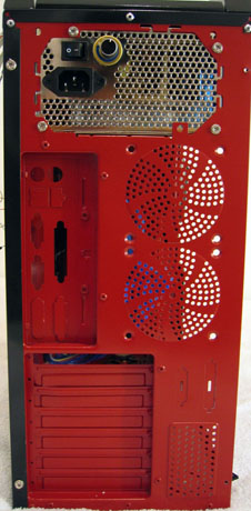
Looking at the backside of the Viper, we see the first signs of a well done paintjob. The entire backplane is painted red to match the color scheme of the Viper. We see mounts for two optional 80mm fans, which we will talk about later, a couple serial/parallel port cutouts, and a removable/replaceable motherboard backplate. MGE also includes a plastic "Static Wire Guard", which is meant to organize and protect the wiring from the system during mobility. We did not think that this was necessary, since wiring can still become tangled and be bent.


41 Comments
View All Comments
k2bordr03 - Tuesday, March 1, 2005 - link
i must say that your reasoning for discarding this case as it being ugly is based on personal preferences. if you dont like it soooo much why did you bother looking, bought this case and i love it. get compliments like crazy at lan parties and you dont have to like it, but someone else might. you guys are too critical, you probably all own kias.Hunter Viking - Wednesday, January 19, 2005 - link
I just got mine. I think the case looks cool. All the beige cases or even the new beige,,, black, been looking at them for years. I wanted something a little different then all the same ol same ol. And I am pushing 40 so take that:)Thanks Anandtech for reviewing something a little different. I can't stand having everything look plain all of the time. Case is stong enough for my SLI setup and quiet enough to be ignored when I am across the room. The lighting is not too bright without being obnoxious. I even added a UV light to brighten up the plastic.
The only problem I have, other then the tooless case, is now I have to open the case and clean the dust bunnnies out more often.
And the blue is more subdued then the red.
albinodragon - Tuesday, December 28, 2004 - link
Personally I had just bought the blue version of the MGE Viper case and it hasn't arrived yet, but I am excited to upgrade my old PC using it!Regs - Tuesday, December 21, 2004 - link
I usually don't pay attention to cases such as these. However this one I couldnt help but to laugh at the design. Looks like a power ranger got shrink rapped around the casing.unclebud - Tuesday, December 21, 2004 - link
"Why is it most modder cases look like a 14 year old metal head design them?Diversity should not mean between a cobra and dragon. All these cases look like album covers from the 1980s."
laughing really hard...
Gatak - Monday, December 20, 2004 - link
Zak, these cases do sell. Lots of people like this kind of thing. No need to be rude. Better to write and say you would rather like something like the Hush cases to be reviewed. =)Zak - Monday, December 20, 2004 - link
Why do you people keep reviewing ugly, BUTT UGLY and useless cases??? This is a waste of time and not worth reading. Stick to reviewing the guts: mobos,cards, etc and leave this for someone else. You're obviosuly not getting it right.Zak
bigpow - Sunday, December 19, 2004 - link
This will match well with a Pontiac Aztec...Woohoo!
crimsonson - Sunday, December 19, 2004 - link
I have to agree,Why is it most modder cases look like a 14 year old metal head design them?
Diversity should not mean betweena cobra and dragon. All these cases look like album covers from the 1980s.
Gatak - Sunday, December 19, 2004 - link
This is what I want! :) http://www.hushtechnologies.net/start.html