The HTC Droid Incredible Review, Clearly Better than the Nexus One
by Anand Lal Shimpi on May 10, 2010 1:27 PM EST- Posted in
- Smartphones
- Snapdragon
- Droid Incredible
- HTC
- Android
- Mobile
Build Quality & Touchscreen Display: Worse and Better than the Nexus
Whereas the Nexus One feels very iPhone like in its curves and narrow seams, the Incredible just doesn’t. It feels cheap, mostly because of the back cover. The back snaps (instead of slides) into place. It’s easier to get on/off than the back panel of the Nexus One, but it’s also not as snug of a fit. I found that the cover on my sample squeaked a lot at the sides, which made it feel very cheap. The Incredible also has a pretty powerful motor for vibration, unfortunately that meant whenever the phone vibrated the back cover made even more noise.
| Physical Comparison | ||||||
| Apple iPhone 3GS (ARM Cortex A8) | HTC Droid Incredible (Qualcomm Snapdragon QSD8650) | Google Nexus One (Qualcomm Snapdragon QSD8250) | ||||
| Height | 115 mm (4.5") | 117.5 mm (4.63") | 119 mm (4.7") | |||
| Width | 62.1 mm (2.44") | 58.5 mm (2.30") | 59.8 mm (2.35") | |||
| Depth | 12.3 mm (0.48") | 11.9 mm (0.47") | 11.5 mm (0.45") | |||
| Weight | 133 g (4.7 oz) | 130 g (4.6 oz) | 130 g (4.6 oz) | |||
| CPU | ARM Cortex A8 @ 600MHz | Qualcomm Scorpion @ 1GHz | Qualcomm Scorpion @ 1GHz | |||
| GPU | PowerVR SGX 535 | Adreno 200 | Adreno 200 | |||
| RAM | 256MB LPDDR1 | 512MB LPDDR1 | 512MB LPDDR1 | |||
| NAND | 16GB or 32GB | 8GB + micro SD | micro SD | |||
| Camera | 3MP | 8MP with LED Flash | 5MP with LED Flash | |||
| Screen | 3.5" 320 x 480 LCD | 3.7" 480 x 800 AMOLED | 3.7" 480 x 800 AMOLED | |||
| Battery | Integrated 4.51Whr | Removable 4.81 Whr | Removable 5.18 Whr | |||
The front is a different story entirely. It’s simple but sexy, and comfortable to use as well. Since you’re mostly interacting with a solid touch screen the cheap feeling disappears. The simple black face looks a lot more modern than the grey/brown color of the Nexus One’s plastic.
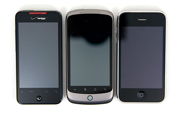
Left to Right: HTC Droid Incredible, Google Nexus One, Apple iPhone 3GS
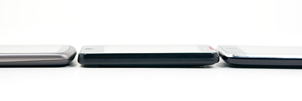
Left to Right: Google Nexus One, HTC Droid Incredible, Apple iPhone 3GS
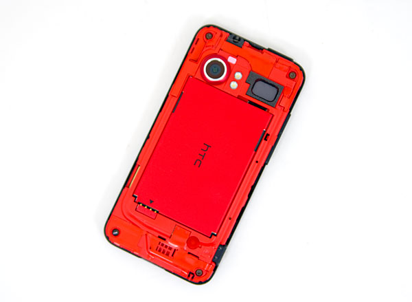
Inside the phone you get access to a removable battery and micro SD card slot. Verizon doesn’t ship the phone with a card, but it does come with 8GB of NAND on board. The Incredible’s inner red is cool and solid enough that I wonder why HTC went with such a boring backplate by comparison.
You get three or four physical buttons on the Incredible, depending on how you count. There’s a power/lock switch up top in the same place as the iPhone, so no confusion there. Volume rocker on the left side. And HTC replaced the trackball on the Nexus One with an optical joystick at the bottom of the screen. While i pretty much never used the trackball on the Nexus One, I like the joystick on the Incredible.
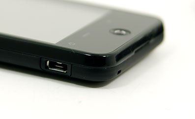
You can use the joystick to scroll, but I used it to move between characters when fixing a typing error (very useful) and as the shutter button in the camera app.
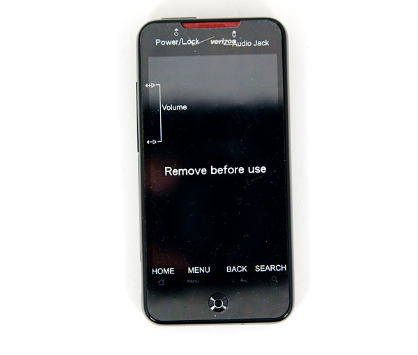
The four fixed, but virtual buttons along the bottom of the phone are like those on the Nexus One although the Menu and Back button positions are reversed. Haptic (vibrate) feedback is enabled by default but you can thankfully disable it on the HTC Incredible.
You get the same 3.7” AMOLED display from the Nexus One with a 480 x 800 resolution. That means it’s something sharper than the iPhone 3GS, with very saturated colors, but beautiful to look at indoors. Outside, in direct sunlight, it’s virtually useless.
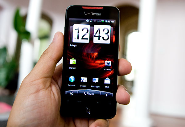
Prepare to crank the display up to full brightness if you use it a lot in direct sunlight.
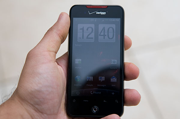
The touchscreen didn't have nearly the same sort of responsiveness problems I encountered on the Nexus One. I'd say HTC managed to deliver a capacitive touchscreen that's virtually indistinguishably from the iPhone in day to day use. I will say that there were a few isolated situations where I had to tap multiple times to get the screen to recognize what I was trying to do. This mostly happened at the corners of the screen


59 Comments
View All Comments
Loser - Monday, May 10, 2010 - link
There is something wrong with the weight you have noted there130 g (3.6 oz) 130 g (4.6 oz)
Both 130g? :)
Anand Lal Shimpi - Monday, May 10, 2010 - link
Woops, fixed. Thank you :)puffpio - Monday, May 10, 2010 - link
I was reading your article, and one part that is slightly incorrect:When you use Goggles and look at buildings, but do not actually take the picture...the tags you see at the bottom of the screen are based off your GPS position and compass..it's not doing any image recognition of the scene until you take the pic...
But it's still cool nonetheless
The0ne - Monday, May 10, 2010 - link
"I honestly doubt if there are many folks who are on the fence between the two."Consumers respond very well to marketing and if the comparison of Incredible to iPhone came down to what you've stated,
1. UI
2. Flexibility
3. Apps
Then it's great. However, your review of the iPhone, in comparison to this review, has all the "ooohh.....aahhhh" associated with it. Little as it may seem, not to Apples awesome marketing team mind you, your review will persuade some consumers to go for the iPhone instead of others regardless of the factors listed.
Please do a respectable tech review and leave your personal opinions and comments for a section dedicated to that purpose. Judging by this review I say the phone stinks mainly because there's not cheering from you. We do respect you, I've followed you since you started the site. I don't like the bias "ohh...ahhs" that comes with the reviews.
Anand Lal Shimpi - Monday, May 10, 2010 - link
A lot of my excitement over the original iPhone has to do with the fact that it was first to deliver the things that made me go ooh and ahh. I'd argue the same is true about Android with features like Goggles. Only Palm has really impressed me in the same manner since then.What I was trying to say with that statement is that if a user plays with both devices they'll quickly figure out which type of person they. The two platforms are very polarizing it seems. As I mentioned in the Nexus One Review, there are folks who are totally unimpressed by the iPhone and others who are very disappointed by Android. It largely has to do with the differing approaches to UI design and role the smartphone plays in their respective corporate strategies.
I stand by my original statement. I believe those who like the iPhone won't find any Android device a suitable replacement. While those who are frustrated by the iPhone's limitations wouldn't dream of anything other than an Android.
Take care,
Anand
teohhanhui - Monday, May 10, 2010 - link
"While those who are frustrated by the iPhone's limitations wouldn't dream of anything other than an Android."There are those who are looking forward to MeeGo...
Anand Lal Shimpi - Monday, May 10, 2010 - link
I'm holding back excitement on that one until we see the right combination of hardware/software. But yes, MeeGo could be very good (not to mention forthcoming Palm/HP stuff).Take care,
Anand
T2k - Thursday, May 13, 2010 - link
MeeGooo? Pleahhhhse.Nokia so far managed to blew everything it's got including the super-widespread, #1 OS of the world Symbian - years after years of clueless mismanagement and still nothing from Nokia.
Nokia is a mess, they just started the third reorganization in 12 months or so... completely clueless MESS and their main dev head just left them recently.
It's Android, people, nothing else - Symbian is waaay behind especially if you consider the breakneck speed Google is developing Android, iPhone and Apple in general is rapidly becoming completely irrelevant especially when Flash won't even work in it.
The only question is WebOS - now that HP is behind Palm we might get some surprise competition for Android: real innovation instead of fake re-badging efforts at ripoff prices a' la Apple.
The0ne - Monday, May 10, 2010 - link
Well said.sebmel - Tuesday, May 11, 2010 - link
Hi Anand, thanks for a great review and contrary to the opinion of 'TheOne' please feel free to express your feelings regarding products. I have read your site for many years, just like 'TheOne' but unlike him I have come to recognise you as someone with intelligence and a good eye for design flair who understands that sometimes the best expression of recognition of design excellence is exactly an ooh or ah.I'm a fan of TopGear, the UK car program. I can just imagine the Soviet dullness that would ensue were 'TheOne' to exercise an editorial veto. The show would flounder in a morass of directives on equal time, exactly duplicated lighting and monotone intonation of spec sheets. I also found his request that you do a 'respectable' review an uncalled for snipe.
It was obvious to any reader that you were enthused about the iPhone because it pushed forward mobile phone OS design significantly. It is also obvious that AnandTech has a number of readers that have difficulty coming to terms with a revitalised Apple corporation and respond to any positive comment with partisan angst. The DailyTech news site you link to unfortunately still thinks its 1990 and regularly trolls for clicks with headlines designed to bait flaming. The result is all to obvious in the ensuing comments.
So, please don't make your reviews lifelessly unemotional. Express pleasure... express surprise. It means something to your readers that someone who spends so much time using the latest products is occasionally moved to pleasure by the competence of designers or developers. Product designers are not driven to greatness by spec. sheet competition. They only achieve it when they attempt to delight. Jonathan Ive, Apple's designer, regularly repeats that he is as proud of what he leaves out of products as what he has included. It is something that you, Anand, obviously understand. I suspect Ive repeats it as often as he does because there are still so many, raised in the Windows 'just add a buggy new feature, break the old format, and call it a new version' years who do not.
We are in a new era in which design excellence and not the politics and skulduggery of format wars is becoming essential. Reviews expressing sincere pleasure or disappointment are entirely appropriate to such a market and provide the kind of feedback that manufacturers and developers need in recognition of their efforts. How on earth can one quantify elegance in terms of grams or bytes? I felt the need to confirm to you that you do have readers who understand your emoting such things.
Keep up the good work.