13-inch Retina MacBook Pro Review (Late 2012)
by Anand Lal Shimpi on November 13, 2012 2:53 AM ESTThe 13-inch Retina Display in Numbers
The latest rMBP features a 13.3-inch, 2560 x 1600 LED backlit IPS LCD panel. Apple maintains a total of four aspect ratios across all of its product lines:
| Apple Display Aspect Ratio | ||||||
| Aspect Ratio | 3:2 | 4:3 | 16:9 | 16:10 | ||
| Apple Product | iPhone 4S | iPad, iPad mini | 11-inch MBA, iPhone 5, iPod Touch (5th gen) | 13-inch MBA, MacBook Pro, Retina MacBook Pro | ||
I'm not sure if you can read anything into this, other than Apple seems to be fine with choosing a different aspect ratio to fit the form factor of whatever device it's building.
The 4MP panel has around 226 pixels per inch, compared to approximately 220 pixels per inch on the 15-inch rMBP's display. The slight increase in pixel density isn't really noticeable.
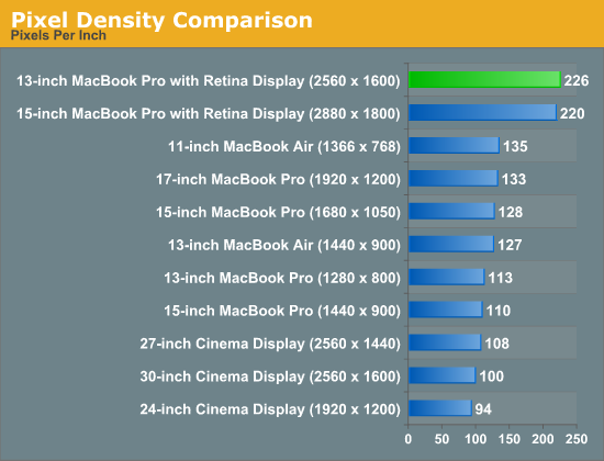
At first sight, the 13-inch rMBP panel is somehow less impressive than the old 15. Part of the problem is the 15-inch surface is just so much larger that it manages to deliver a pretty substantial impact. It's the problem of being compared to such an overachieving sibling: anything you do is just never good enough.
Despite its inability to outshine the 15-inch rMBP panel, the display on the 13-inch model is gorgeous. Viewing angles are great thanks to the use of IPS technology. Brightness and contrast are both top notch as well:
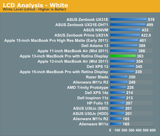
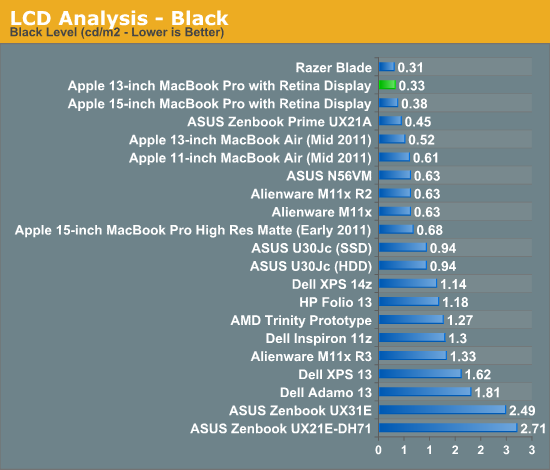
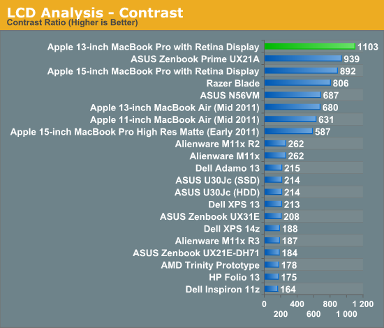
Color accuracy and gamut are both within the range of the 15-inch model, putting them among the best we've tested:
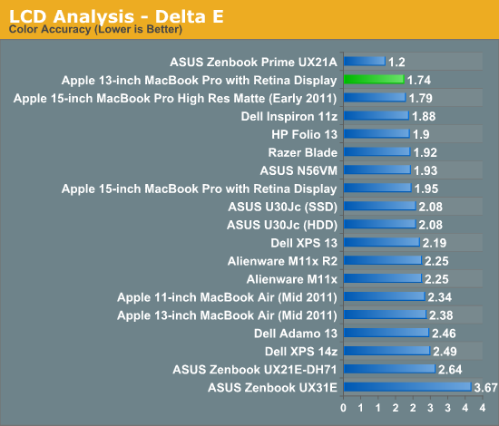
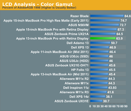
I also ran the 13-inch rMBP through our CalMAN smartphone/tablet workflow to compare it to Apple's iPad and iPhone 5. The results are very impressive (remember for the dE2000 values, lower numbers are better/more accurate colors):
| CalMAN Display Comparison | ||||||||
| Apple iPad (3rd gen) | Apple iPhone 5 | 13-inch rMBP (uncalibrated) | 13-inch rMBP (calibrated) | 15-inch rMBP (calibrated) | ||||
| Grayscale 200 nits Avg dE2000 | 3.7333 | 3.564 | 1.7825 | 1.6997 | 1.8074 | |||
| CCT Avg (K) | 6857K | 6925K | 6632K | 6545K | 6583K | |||
| Saturation Sweep Avg dE2000 | 3.193 | 3.591 | 2.1663 | 1.2269 | 1.335 | |||
| GMB Colorchecker Avg dE2000 | 3.0698 | 4.747 | 2.4521 | 1.0966 | 1.1714 | |||
Straight from the factory, the 13-inch rMBP display is a bit more accurate than what you get from the 3rd gen iPad and the iPhone 5. With an additional calibration pass using our i1 Pro spectrophotometer the rMBP display is in a different league. Once again we see relatively similar performance between the 13 and 15-inch rMBP displays.


79 Comments
View All Comments
MrCromulent - Tuesday, November 13, 2012 - link
Thanks for the thorough review! I was really looking forward to the 13" version of the rMBP as a possible desktop replacement machine for development, but I guess I'm going to pass this year.Multi-monitor performance (internal display plus 2 external ones) would be excruciatingly bad, I presume? Or is it acceptable because most of the stuttering seems to be caused by CPU issues instead of a GPU bottleneck?
Freakie - Tuesday, November 13, 2012 - link
I would encourage you to pass. This 13" rMBP has COMPLETELY lost it's "Pro" name. Dual-core with no dedicated GPU, only 8GB of RAM, paltry amounts of storage, and a screen that's only good for resolution, not for quality, makes this a stupid choice for any art professional. The thing can't even run a Safari window with Facebook on it without dropping below 30fps! Add the $1,700 price tag to all of this and you have to be out of your mind to buy it. And trying to multi-monitor is going to drive you nuts performance wise.And now for a slight rant on the Review it's self:
"You don't sacrifice display quality at all in the move to the smaller panel. Brightness, contrast and color reproduction are all great."
This line particularly bugged me, which shows Anand's bias for Apple yet again. Brightness is good, not great, and color reproduction is horrendous. You DO sacrifice a lot in switching to these displays. Artwork on this display is color suicide. And I haven't seen a computer screen have after images like you described in well over 6 years. In my opinion quality has gone WAY down.
So not only is your built-in display crappy for work, but if you plug another screen in then suddenly you've maxed out your CPU's performance, and that's before you've even started working.
I'm sorry, Anand, but this entire review seems to dock points off again and again, and yet you still manage to say that it's nearly perfect in your conclusion. While I do appreciate that you've been more forward towards issues on the devices in your Apple reviews as of the last few that you've done, in the end it seems like you just conveniently forget about them and write apologetically about them where as Dustin would, and does, expose all of a laptop's flaws and strengths and does a good job of not sugar coating or glazing over problems. When Dustin sees a machine not living up to what it is supposed to be, he doesn't pull back any punches and calls it out. It seems obvious that this machine is not "Pro" in any way imaginable and I really feel that should have been pointed out.
guidryp - Tuesday, November 13, 2012 - link
Nice Rant. Too bad it is nonsense.Horrendous color reproduction?
The screen has the best contrast of any tested and the second best color accuracy. Also this is an IPS screen with superior color stability vs angle of view. Much better than the TN screens that occupy the vast majority of laptops. It is a fantastic screen in terms of resolution, color accuracy, contrast and color stability.
Image retention is the only real fault and if it was a significant issue, return it.
As far as it losing "Pro" status for not having quad core/discrete GPU, that is no change, it was like that last year as well. If this is your definition of Pro, I am sure you can find a suitable cheap Dell that has quad core.
Bottom line. I do think it is probably early to jump to this Retina Model because of potential performance hiccups, and you are better off waiting for a Haswell model. But there is no need to resort to nonsense ranting to state that.
Freakie - Tuesday, November 13, 2012 - link
IPS means next to nothing. It's just one small part of the entire range of components and technologies that go into making a good display. IPS is chosen for high resolution displays for different reasons other than color.And it's Delta E value gains nothing from being second best, as best is so far ahead of it it's ridiculous. Anandtech's method of obtaining Delta E is taking the best value after repeating the test multiple times, and with how close it is to so many other monitors, and how even a screen being on for 5 minutes versus 10 minutes can affect screen color tests small amounts, it actually isn't that hard to summarize the test results by saying that it essentially has the same color representation as the 5 notebooks behind it.
And Color Space is VERY important for artwork. It's nice to have a good Delta E but without a wide color space, you're still shooting yourself in the foot and your results will be noticeably inconsistent and will require a lot more fiddling within your editing programs to get right.
And my definition of Pro is what the MBP used to be, a powerful laptop that could reliably be used for professional work when you aren't at your desk and that sacrificed some weight and size in order to deliver the power that you need. This MBP does not live up to the MBP name and should just be a regular Macbook (but of course they got rid of those and just turned the MBP's into normal Macbooks).
But no thank you on the Dell :) I wouldn't never own one of their consumer models and their professional models are rather pricey. I'd rather just Build-To-Order a nice ASUS and pay the extra $100 for the 95% NTSC Gamut Matte screen.
guidryp - Tuesday, November 13, 2012 - link
95% NTSC screens are just about useless for 99.99% of users.We live in an sRGB/Rec. 709 world, and that should be the goal for most screens, and the Retina MBP is very close to this much more important standard. Actually Anand should actually report the sRGB match in his reviews since it is so much more important for most users.
Wider gamut than sRGB screens simply cause more problems than benefits, causing jarring color inaccuracy as you move back and forth between color managed and non color managed applications.
It is a fallacy to simply think, a bigger number is always better when it comes to color gamut.
Freakie - Thursday, November 15, 2012 - link
It's not for 99.99% of users, MacBook Pro's were meant for professionals, but now because Apple wants more money, they got rid of the regular MacBooks and put crappier hardware in their Pro's. So for the people who buy the Pro's because they need a Pro machine, a 95% NTSC DOES matter.And even in the sRBG the Retina displays suck. 64% of AdobeRBG is still below 90% sRBG so it doesn't get any extra points even if you wanted to try to argue that for some reason sRBG is better. And I would disagree that wider than sRBG is problematic, especially when switching between color managed situations. Yes, switching from a non-calibrated screen from a calibrated one is weird if the non-calibrated one sucks, but who cares? The whole point of having the wide gamut, calibrated screen is so that your work comes out correct, not so that your browser window looks right -_-
And it's not fallacy :P When you're working on something that you're going to print, or display through high resolution means like digital signage or movies on a projector... Those devices and mediums that your are going to be displaying it through will have wide gamuts. Obviously print has a wide gamut, and most digital signage uses the same 32"+ high resolution high gamut displays, and a professional movie projector for films will also have the same. So if you work on your project on an sRBG screen you will be sorry when you see it displayed/printed elsewhere.
jmelgaard - Thursday, November 15, 2012 - link
I Seem to be confused here... But you seem to imply that you only belong in the professional segment if you use your computer for graphical work?...Damn... And here I thought I used mine for Professional Application Development... BUMMER!... Ill better start looking for another job, one with Pictures and Colors and Gamuts and Colors and OMG my head hurts now...
WebJester - Tuesday, March 26, 2013 - link
I see you glossed over the comment about calibration.aguilpa1 - Tuesday, November 13, 2012 - link
Color reproduction was only part of his reasons for noting that there should be a distinct difference between a Macbook and a MacbookPro. I have to agree with him. The Pro was for Professionals that did not mind the extra weight or size as long as they could get the options and upgrades they needed. The fact that you mention stupidly that maybe he should go get a Dell if he wants a 4 core CPU should slap you in the face as obvious that the MacbookPro is not a Pro if a cheaper model offers what it does not.TEAMSWITCHER - Tuesday, November 13, 2012 - link
I have been waiting for this review, because I already upgraded from an older 15" dual-core MacBook Pro to this laptop. I did notice the minor "choppiness" when scrolling web pages, but it's not intolerable. I was expecting the HD4000 to be a total dog at 3D. To my surprise it wasn't all bad. To be honest though, I play mostly older games.The display is easily...hands down...no questions about it...the best I have ever used. Game over - thank you for playing. Now, when I look at non-retina displays, I immediately notice the difference - and I don't like what I see. I desperately want a 27" Retina Thunderbolt display. Maybe they can add discrete graphics to the display for the best of both worlds. Please Apple, make this happen.
But where this laptop really shines is it's portability. Having used a 15" Pro laptop for the last eight years, the difference is striking. I was tempted by the 13" MacBook Air, but the grey bezel around the screen felt like a step back from the edge-to-edge glass that I have grown to love. This feels every bit like the Pro Machine I have been using for the last three years. I can't express how comforting it was to drop so much weight, yet retain the same great keyboard, trackpad, quality construction, and performance. Truly an amazing feat and why the "Pro" moniker is deserved.
This isn't the laptop for everyone, but for me...web browsing, coding, and just always having a great computer at my finger tips...it's pretty close to perfect.