The Huawei P8 Review
by Andrei Frumusanu on June 4, 2015 8:00 AM EST- Posted in
- Smartphones
- Huawei
- Mobile
- P8
- Kirin 930
Software - EmotionUI 3.1
One of the aspects I found positive about the Mate 7 and Honor 6 was EmotionUI. In both iterations Huawei was able to impress with their differentiation, even if there were some stumbles in terms of usability. The P8 ships off with the first Android 5.0 Lolipop implementation of EmotionUI, which now sits at version 3.1. To get to the point, it seems that this was only a minor incremental update in terms of UX design and experience.
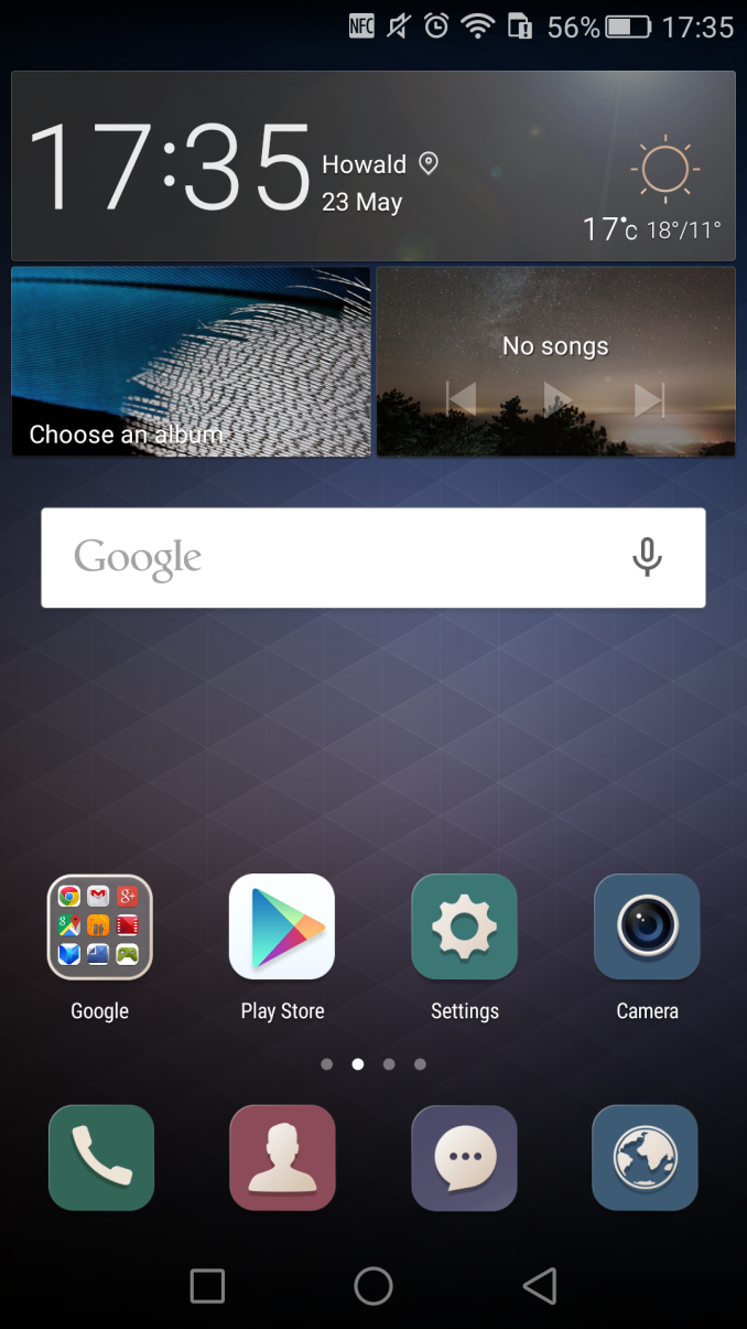
The P8's default theme and general design language shifts from the extremely bright and minimalistic take that we've seen in EmotionUI 3.0 of the Mate 7 towards a more colourful and contrasted UI. The blindingly white screens and hard to distinguish grey icons of the previous version are now gone in favour of more distinguishable replacements. All that needed to be done was to add colourful backgrounds to the glyphs - and that's exactly what Huawei has done here.
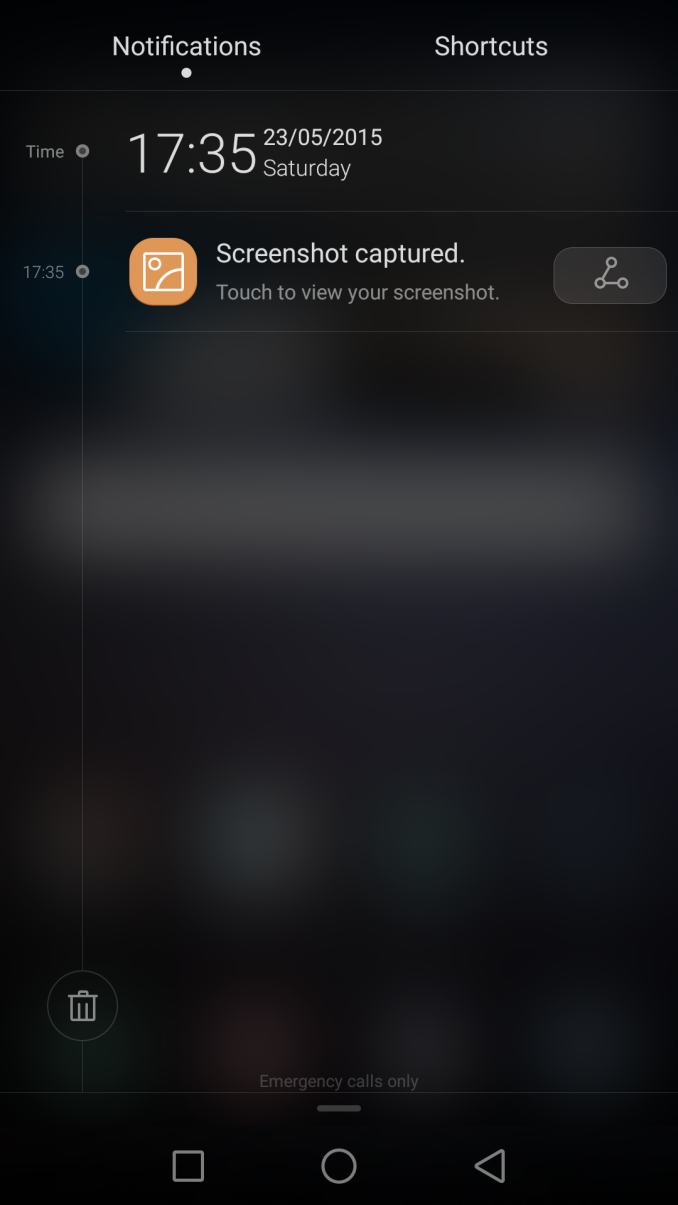
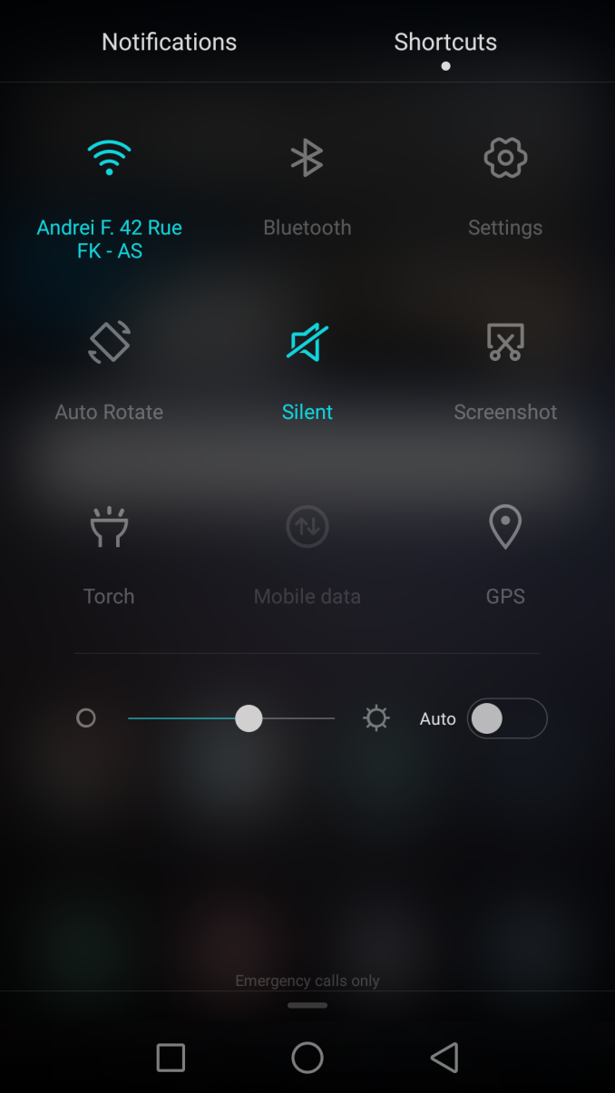
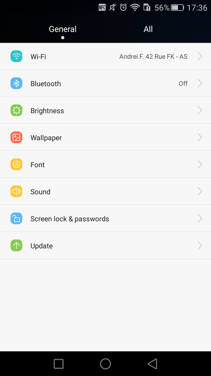
The notification shade is now a translucent black with a gaussian blur effect. It also seems Huawei has made better use of the settings panel, as it drops the lesser used shortcuts and increases the size of the remaining ones. The settings menu is comprehensive and offers a variety of options in the categories you expect them to be.
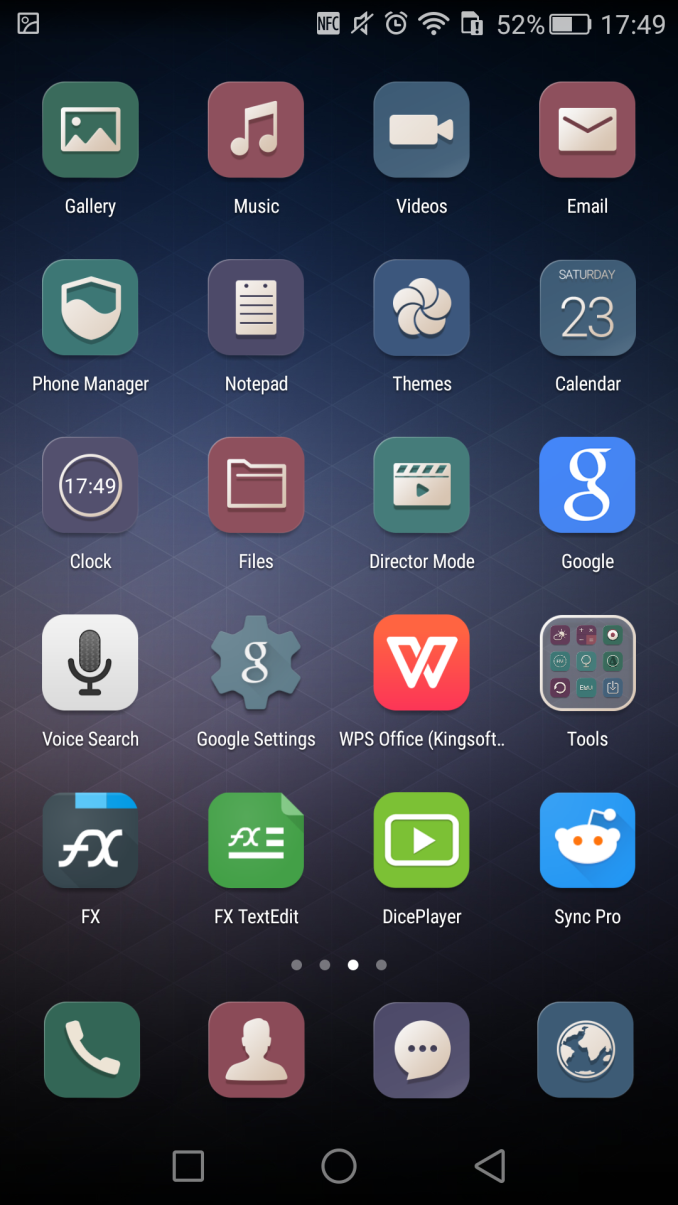
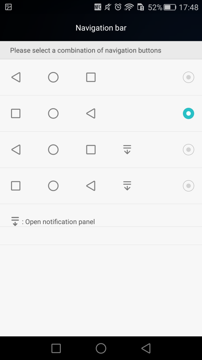
Huawei continues the choice of not including an application drawer with the EmUI launcher, so all installed apps are placed on the launcher screens. Here again we see the practice of having standardized icon frames for all applications, something I'm personally not a big fan of and see it as the biggest incentive to go the route of an alternative third-party launcher. It would be appreciated if Huawei had at least included the option to disable app-icon framing throughout the OS.
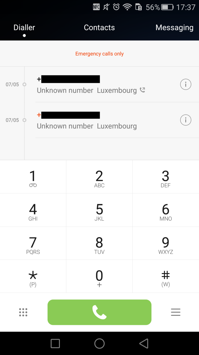
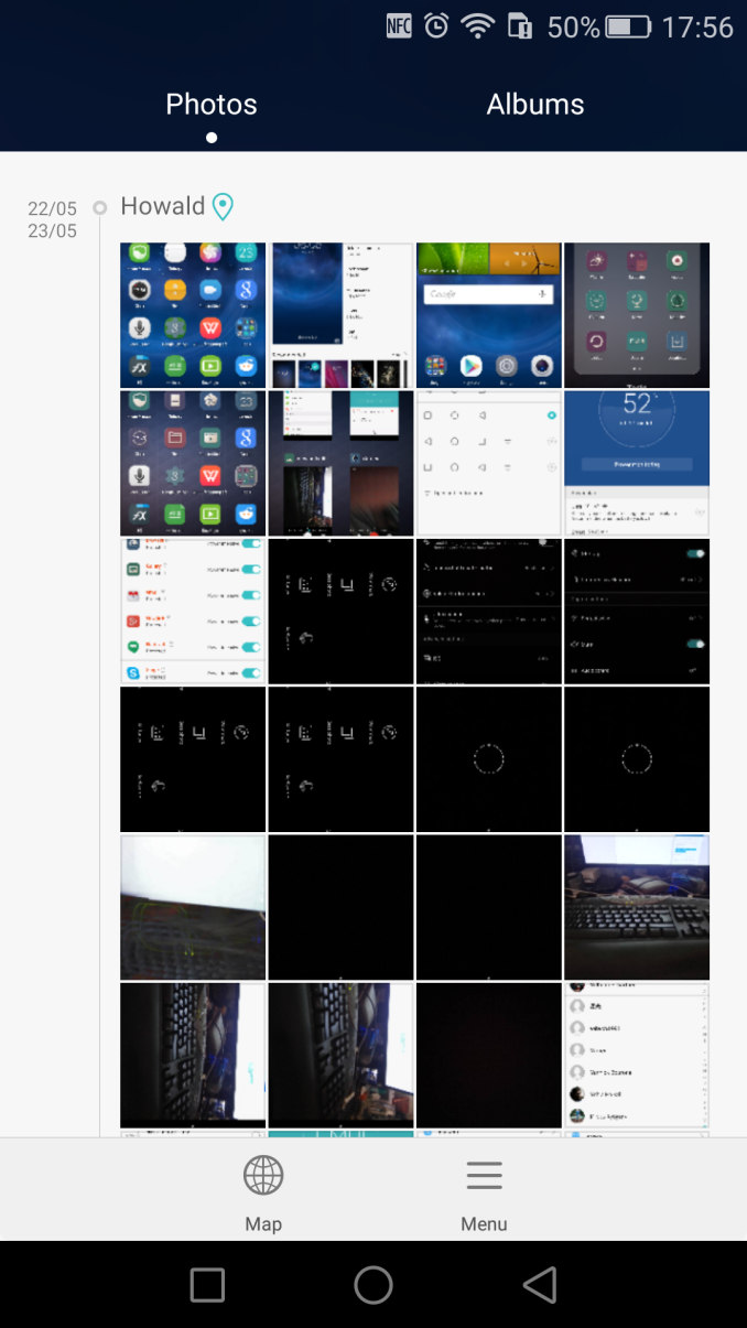
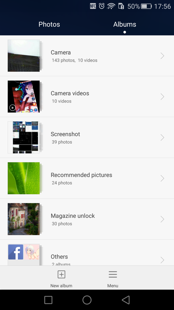
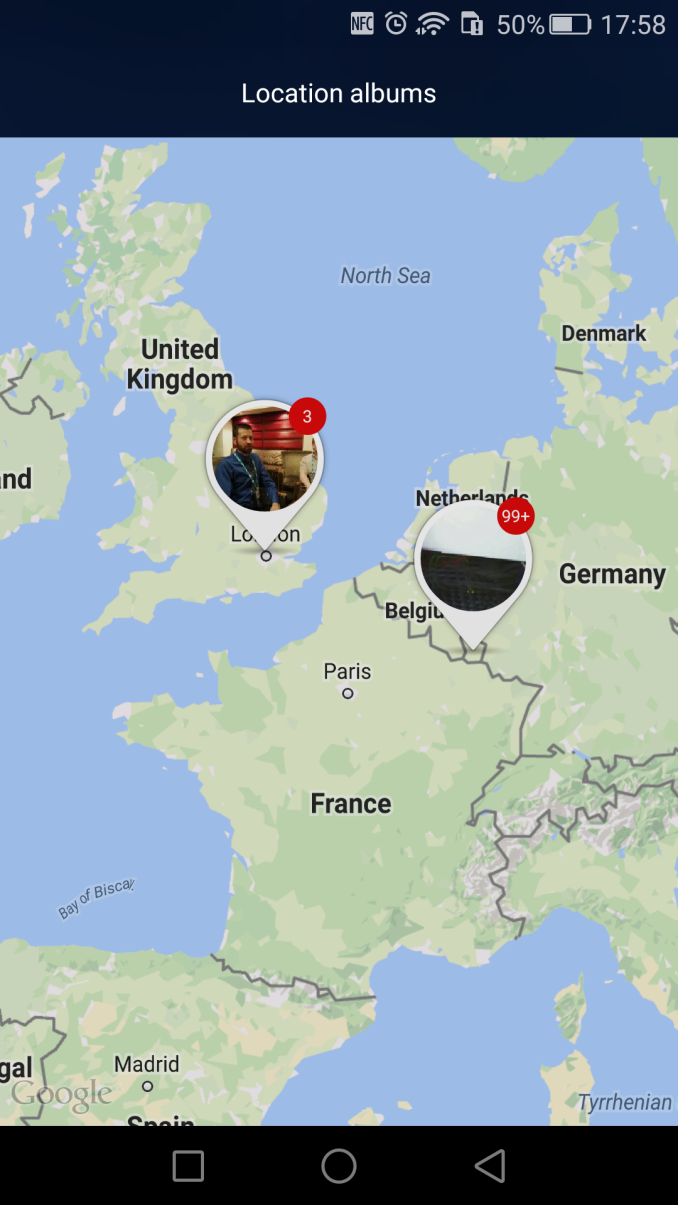
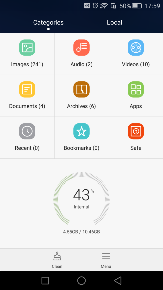
The system applications are a minor evolution of what we saw on EmotionUI 3.0. The most notable changes are the theme accents such as the black bar colour of the various in-built apps such as the dialer and gallery app.
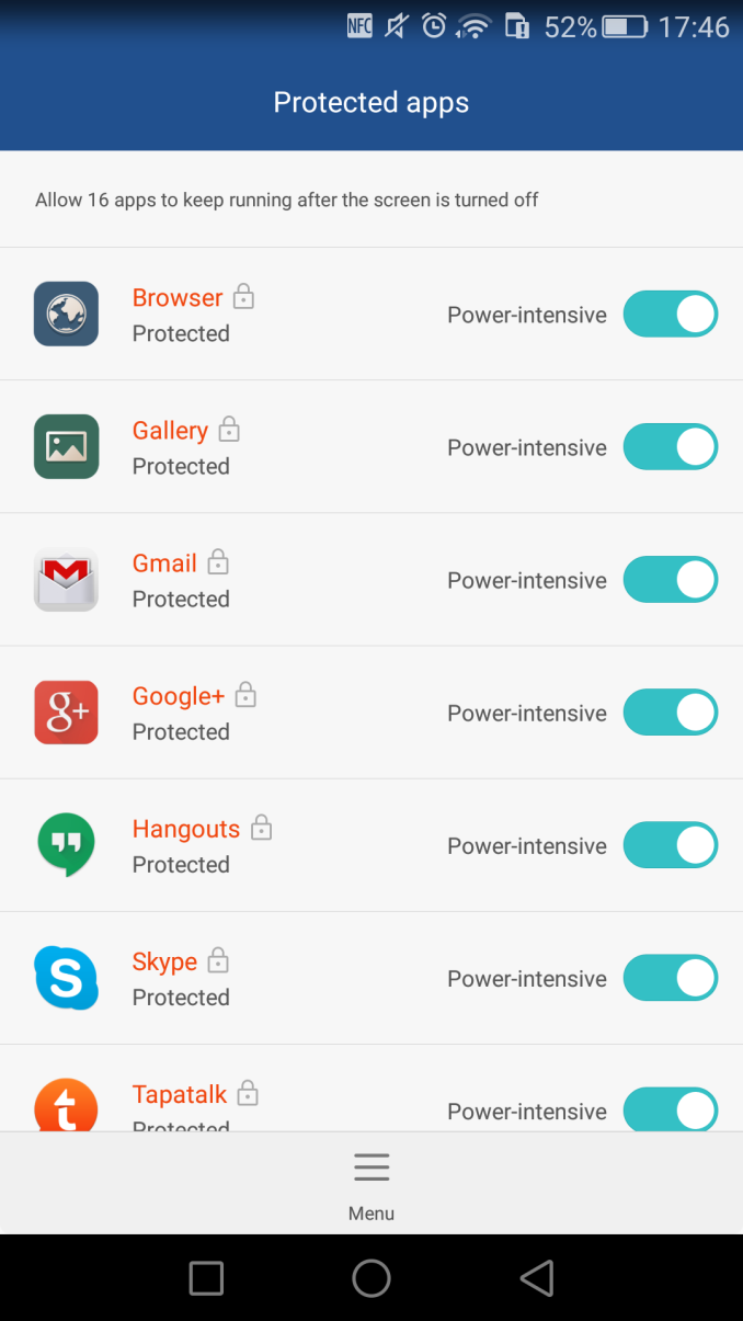
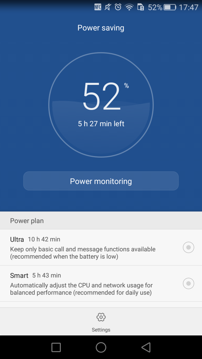
A rather nagging aspect of the default settings of the device is the power monitoring of background applications. Huawei closely tracks and logs process activity whenever an application is active in the background. This is certainly helpful to track down rogue applications, but it would have been better to have the tool have more lax warning thresholds as it will get triggered by many apps even if their background activity is only minimal.
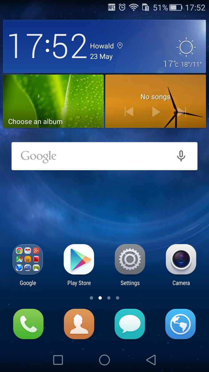
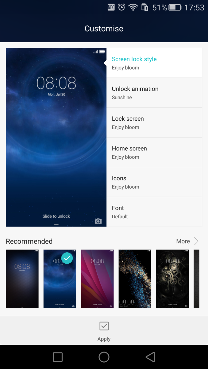
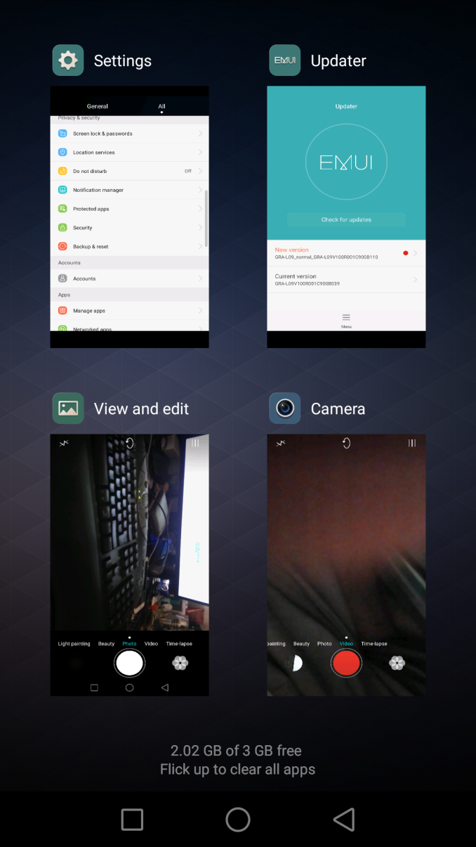
Since starting the review on the device's stock firmware of GRA-L09V100R001C900B039 Huawei has already sent out two OTA updates which are supposed to improve system stability and performance. A notable fix which some reviewers didn't get to see was the option to disable "Smart Screenshot", a feature where one would double-tap or draw with a knuckle to capture a screenshot. This was quite annoying as it had quite a lot of false positives detecting normal fingers as a knuckle and making you start drawing an outline for a screenshot when for example you wanted to pull down the notification shade. With this being addressed in the latest OTA, I'm left to find very few outstanding faults with the software.
EmotionUI 3.1 on the P8 didn't bring any larger changes even though this is Huawei's first Android 5.0 Lolipop implementation. The very simply addition of coloured icon backgrounds brings a lot variety to the UI, and it polishes what was for me an already clean and good-looking OEM skin. Considering this device is powered by a weaker A53 SoC, the UI performance was still good although not perfect. At the first glance it seems that the CPU isn't able to match other more powerful flagships with bigger cores, so let's move on to the benchmark section to see what it actually performs like.




104 Comments
View All Comments
Taneli - Thursday, June 4, 2015 - link
Another iPhone clone from Asianiva - Thursday, June 4, 2015 - link
How is this thing an iPhone clone?der - Thursday, June 4, 2015 - link
Design Profile, Camera UI, yada yada yadaEthos Evoss - Friday, June 12, 2015 - link
another asholeshaolin95 - Tuesday, September 15, 2015 - link
bingo! lol Taneli you are such a loserrandom2 - Sunday, June 7, 2015 - link
All phones are iPhone clones. Don't you know anything? :)Ammaross - Monday, June 8, 2015 - link
At least that's what Apple's lawsuits have claimed....Ethos Evoss - Friday, June 12, 2015 - link
nothingEthos Evoss - Friday, June 12, 2015 - link
no iphone copied sony ...http://www.dailytech.com/Samsung+Apples+iPhone+Sta...Refuge - Friday, June 12, 2015 - link
it is also a rectangle? Didn't they have a patent on that at one time? lol