MGE Viper: Another Xtreme Gamer Creation
by Purav Sanghani on December 18, 2004 5:14 PM EST- Posted in
- Cases/Cooling/PSUs
Internal Design
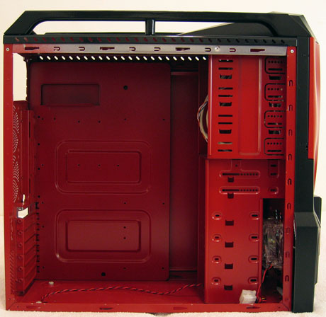
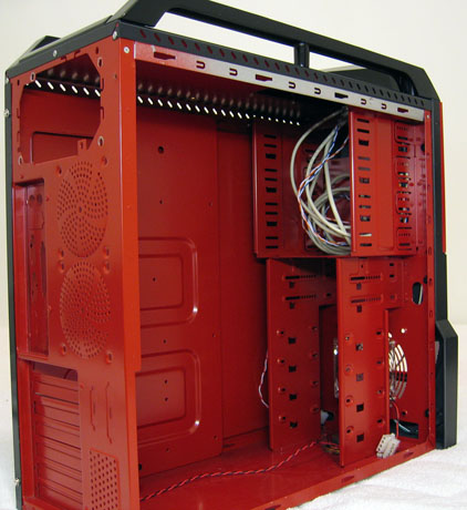
As we opened up the Viper, we were quickly blasted back to our look at the Sidewinder in mid-October. The Viper has the same internals as the Sidewinder in every aspect except the red paintjob (matching paint to the external shell), and we can, therefore, safely assume that they are both based on the same model.The internal structure includes drive bay mounts, which compose the entire front 1/3 of the chassis. There are a total of four 5-1/4" drive bays and six 3-1/2" drive bays, two of those being external for applications such as floppy drives, flash card readers, etc.
Also, just like the Sidewinder, the Viper has no tool-less features for its drive bays. Being a gaming chassis, we would expect MGE to implement even the simplest type of tool-less device. At the least, we would have liked to see thumbscrews for securing the side panels if not the drive bays.
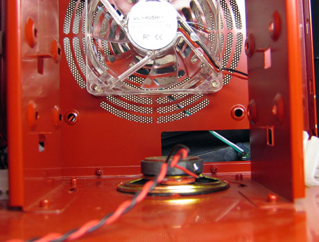
One thing that worried us was the placement of the case's PC speaker at the bottom of the case, vertically in line with the drive bays. This puts the magnet bearing speaker about 3/4" below the bottom-most HDD, which could lead to data corruption. We recommend that either users remove this speaker or MGE change their design and move it to an area away from the drive bays.
The Viper does have plenty of space to work with. Besides the space to add up to six 3-1/2" drives and four 5-1/4" drives, there is plenty of clearance between the motherboard tray and the drive bays, 2-1/2" to be exact.
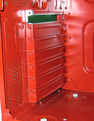
The expansion slots also lack tool-less features. MGE has kept the traditional Philips head mounting screw method to secure add-on cards to the Viper.


41 Comments
View All Comments
Denial - Saturday, December 18, 2004 - link
Wow, I'm at a loss for words. Who buy such a thing?Nice review :)
radx - Saturday, December 18, 2004 - link
Can't say i love the design of this case. But i do like one thing better with this case than my own Antec Sonata, that be the 120MM fan behind the hard drives. Rather than my case which has the 120mm fan infront of the hard drives.Other than that another cool review done by the guys at anandtech :)
Gatak - Saturday, December 18, 2004 - link
A few of them:http://www.mini-itx.com/projects/decobox/images/de...
http://www.mini-itx.com/news/images/story0363b.jpg
http://www.mini-itx.com/news/computex2004-4/images...
http://www.mini-itx.com/news/images/story0353.jpg
http://www.mini-itx.com/projects/gramaphone-itx-hd...
http://www.mini-itx.com/news/computex2004-4/images...
http://www.mini-itx.com/news/images/story0330.jpg
Gatak - Saturday, December 18, 2004 - link
How about looking for quality cases which are more pleasingly designed? Instead of monsters I would like to see something that would fit nicely in a modern home. Look on how expensive home cinema receivers are designed.Look on this page for many really nice cases: http://www.mini-itx.com/
A few of them:
Locut0s - Saturday, December 18, 2004 - link
To make it clear Purav I'm not saying that Anandtech should look at cases on their external merits alone as you suggest many who complain about style are suggesting. In fact I don't think many of us who are complaining about style are saying that at all. Instead we are saying in many instances "What a shame that such a good case is ruined by such ugly looks". Unlike the internals of a computer where I think looks truly don't matter the chassis is really the only physical presence of the computer that you are ever ware of on a day to day basis. As such many of us would prefer not to have our chassis making a statement such as "hay look how cool I am over here Look Look Look...!" That doesn't mean that the internals of a case are not the most important thing, far from it they are the most important aspect of any case. But that doesn't mean that the external design of a case can't almost completely offset all the goodies inside, it definitely can. No matter how good the internals of a case are I am not purchase a bright yellow Pikachu case for example.By the way I happen to really look forward to most of the case reviews here at Anandtech, they are very thorough and informative. It's not the reviews I have a beef with, it's the trend in the industry to this look that I don't like.
Just my 2 cents
GnomeCop - Saturday, December 18, 2004 - link
sickNovaoblivion - Saturday, December 18, 2004 - link
should be- External visuals wont appeal to anyone
lol
Kccdx2 - Saturday, December 18, 2004 - link
Too true #1shoRunner - Saturday, December 18, 2004 - link
yeah whats up with all the cases looking like they were designed by playschool. More funky colored plastic is not better. Its a computer not an action figureLocut0s - Saturday, December 18, 2004 - link
*sigh*The following needs to be in bold in "The Bad" section:
- External visuals may not appeal to some
Or maybe a label on the box "For ages 12 and under"