AMD Previews New Catalyst Control Center Interface
by Ryan Smith on December 13, 2010 12:01 AM ESTAMD Previews New Catalyst Control Center Interface
Back on December 2nd AMD’s Catalyst Product Manager, Terry Makedon, posted an interesting if cryptic note on his Twitter feed: “Catalyst 10.12 is going to be HUGE”. Since then there’s been some speculation on just what was going to be huge, but nothing quite hit the mark until the last couple of days.
With release date for the Catalyst 10.12 driver set finally upon us, AMD has taken the wraps off of what they’ve been up to. The huge news? The Catalyst Control Center is getting a significant interface refresh; its latest since the middle of last year, and certainly the biggest one to date.
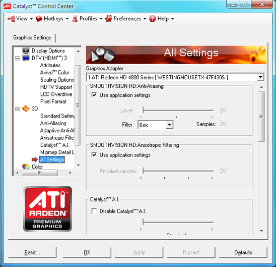
Before we get too far ahead of ourselves though, let’s start at the beginning. Catalyst Control Center, AMD’s GPU configuration control panel, is one of the last vestiges of the old ATI. Released back in 2004 to a tepid response, it has received a number of upgrades over the years (including a previous interface refresh only a year and a half ago) but is in a number of ways still the same utility since the ATI days. Going forward however, AMD has finally put the ATI brand to rest 4 years after the acquisition, and with the retirement the ATI branding those last vestiges of ATI are being modernized. In the case of the Catalyst Control Center, this means among other things replacing the red ATI livery with AMD’s green & black livery.

Catalyst Control Center up to 9.6

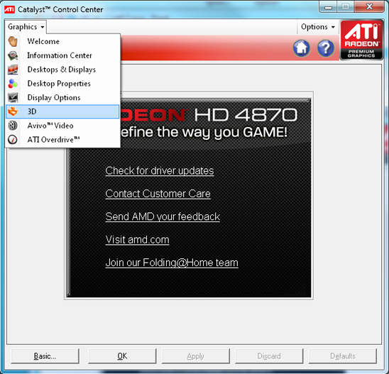
Current Catalyst Control Center
At the same time, Catalyst Control Center is about to become much more important. AMD purchased ATI because they foresaw the importance of having a graphics division to design GPUs for future CPU products with on-die GPUs – the newly christened APU. Work on integrating a GPU and a CPU started early so the importance of the hardware has always been self-evident, but software has been another matter. With AMD’s first APUs launching next year, the software side of the equation is finally coming together and it’s the Catalyst Control Center at the middle of it all (and the fact that we first saw the new CCC running on Zacate says a lot right there).
Going forward, the Catalyst Control Center will be AMD’s primary CPU/GPU/APU configuration utility. Today we’re just seeing the next evolution of the Catalyst Control Center as a GPU configuration utility, but next year AMD will start bringing in features for their APUs and CPUs. So in many ways this is just the first half of the story as we still don’t know just how the Catalyst Control Center will integrate CPU/APU controls, or for that matter what will become controllable.

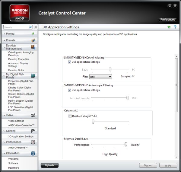
New Catalyst Control Center (Advanced View)
As far as GPUs are concerned at the moment, the new Catalyst Control Center is more or less a reskin of the previous version. The functionality is still identical if not slightly outdated – the preview version still uses the old 3D Settings dialog for the pre-6000 series cards – but a fresh coat of paint can work some small miracles.
The biggest change is going to be for casual users, who previously had to choose between the full “Advanced” view, and the anemic “Basic” view. Basic was simple to the point of heavily limited functionality, and for that reason the bulk of the overhaul has been on the casual side of things. Basic is being replaced with the Standard view, which this time is an appropriately pared down version of the Advanced view. Standard uses a hierarchical organizational system to help point users to the right control panel, grouping together control panels on the basis of Video, Gaming, etc; and then things are subcategorized, such as the case is with the Anti-Aliasing and Ansiotropic Filtering control panels which make up the Image Quality subcategory of Gaming. Each category and subcategory has a short but to the point description of what the section does; Image Quality for example has the text “Changes settings to enhance image quality in games and other 3D applications”. All of this eventually leads to the individual control panels, which are basically unchanged from previous versions of the Catalyst Control Center.
Meanwhile for Advanced users the difference is much smaller. The loathed drop-down menu to select an individual control panel is gone, bringing back the tree view. In the process AMD has simplified the tree view to remove access to the redundant control panels meant for Standard use, leaving only the full control panels such as 3D Application Settings that let power users find and control everything about image quality at once. At the same time the desktop and display management control panels have been moved in to the tree, grossly simplifying the process of configuring these options (half of which were hidden in other control panels) and something that undoubtedly is going to be well received by monitor and HDTV users who could never find the Scaling Options and HDTV Support control panels respectively. Again it’s mostly a fresh coat of paint, but it’s definitely easier to find things than on the previous version of Catalyst Control Center.
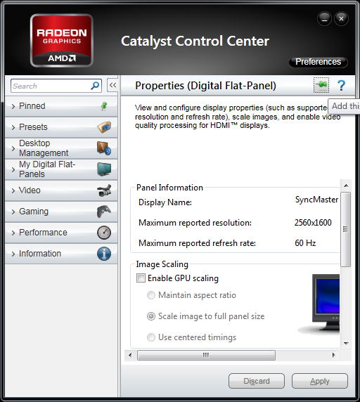
Common to all views for the new Catalyst Control Center is resizability and pinning. Resizability has been a sorely needed feature for the Catalyst Control Center, as the fixed size window got along poorly with low resolution displays, particularly HDTV owners looking to setup their TVs when they default to 480P. The actual control panels are still a fixed size – nothing reflows to match the window size – but now the Catalyst Control Center allows scrolling to access the entire control panel through a fairly small window. Meanwhile pinning allows users in both views to add a control panel to a list of pinned pages for easy future access, though this is likely going to be much more beneficial to Standard users as a stepping stone to Advanced view than it will be beneficial to Advanced users.

Yes, They Have Resizing
AMD is touting the fact that they partnered with Infusion, a UI design firm, in order to design the new Catalyst Control Center. Whether Infusion deserves all of the credit or not, the fact of the matter is that the old Catalyst Control Center set a rather low bar, giving AMD/Infusion a clear path towards improving the Catalyst Control Center.
Going forward AMD is promising to make future improvements to the Catalyst Control Center. As we previously mentioned, we expect APU/CPU controls to be added to the Catalyst Control Center next year for AMDs upcoming products, though we don’t know quite what those controls will be. On the GPU side of things AMD is more specifically promising further improvements in display management, which has been a continually evolving process for the company as they adjust to feedback from Eyefinity users. Meanwhile we’re still holding out hope for proper (NVIDIA-style) application profiles after AMD has once again missed an opportunity to implement those. Generally speaking we’re indifferent towards AMD and NVIDIA's control panels, but that’s the one area where NVIDIA has a specific, significant edge.
For the time being, the new UI is going to be available as a preview with Catalyst 10.12. AMD will be releasing a regular version of 10.12 with the old version of Catalyst Control Center, and alongside it will be releasing a version of 10.12 with the same drivers but with the preview version of the new Catalyst Control Center instead. And it should be noted that the new Catalyst Control Center is for Windows Vista and later only – Windows XP users will be stuck with the previous version of the Catalyst Control Center. AMD is using some Vista/7 only features for the new Catalyst Control Center, particularly the Windows Presentation Foundation, which means it’s not (easily) backported to Windows XP.
Finally, in spite of the changes to both the interface and the underpinnings of the Catalyst Control Center, performance remains unchanged. We’ve clocked both the old version and the new version at around 1.5 seconds to launch on our GPU test rig and practically instantaneous switching between control panels.


80 Comments
View All Comments
thernus - Monday, December 13, 2010 - link
I hope so! been itching to see how the 6970 stacks up against my 580!jeremyshaw - Monday, December 13, 2010 - link
Nice! Good to see the old UI being refreshed after a long time. The drop down menu didn't really annoy me as much as it was just dated for an easy to use interface, IMO.Glonk - Monday, December 13, 2010 - link
Infusion isn't a "UI Design" firm...they're a Canadian (local to AMD Canada/oldschool ATI) MS-partner (read: "we only ever do MS work") consulting company that hires naive new grads, works them to death while billing customers a ton, then hires new grads to replace the old ones when they get fed up and leave. It's the EA business model.I wouldn't expect miracles here. The kids probably got a couple weeks to hammer this out. Thus the feeling that it's just a coat of paint.
Glonk2 - Tuesday, December 14, 2010 - link
Don't be so bitter Dave.abe222 - Tuesday, December 14, 2010 - link
Hmm Infusion made this listhttp://www.canadastop100.com/toronto/
JSef - Tuesday, December 14, 2010 - link
Those lists are a joke. None of their criteria look at things like employee satisfaction. They simply look at what are the on-paper policies. What's on paper may not be what's actually permitted. For example, many companies get points for being "telecommute" friendly, but when you start telecommuting you get warnings and general trouble.A more accurate look would be at sites like Glassdoor.com.
ajp_anton - Monday, December 13, 2010 - link
Just because there is some unconsistent cutting of the screenshots' borders, I assume you don't know that by pressing Alt+printscreen you only capture the active window, not the whole screen.Also I like the AMD logo better than ATI.
Ryan Smith - Monday, December 13, 2010 - link
I take it you're referring to the shots of the old CCC? Those are archive photos; obviously the new ones don't have that issue.iLLz - Monday, December 13, 2010 - link
It looks like the normal Vista/Win7 bordering to me. When a window isn't maximized you get the border around it that its translucent with Aero is switch on, which it was when those screenshots were taken. You can clearly see the desktop blurry behind it.Minion4Hire - Monday, December 13, 2010 - link
And why does it being an archive photo instantly mean it couldn't have been taken from within Vista? It was released (to the general public) on January 30th of 2007. Which means that those screencaps could be up to four years old (they aren't, I'm just saying).But how an image was or wasn't cropped seems like a weird thing to get hung up on, especially when it's clearly an old image (I'm sure Ryan didn't install and screencap Catalyst 9.6 just for this article)